Create Custom Components

This tutorial combines VIBES, Makeswift, and Next.js primitives to build a custom Catalyst product carousel component that:

  • Content authors can edit visually in Makeswift
  • Fetches product data from BigCommerce
  • Shoppers can browse to see products from your store

Prerequisites

  • A Makeswift-connected Catalyst project. See Makeswift for which setup paths give you one.
  • The project running locally, connected to your development Makeswift site. See Run locally.

The paths in this tutorial are relative to your project root. If your project uses the older monorepo structure, they’re relative to the core/ directory instead.

Create a “Hello World” component

Before you build the product carousel, create a HelloWorld component to check that your development environment works and to get familiar with the code you’ll write.

Create a new folder in the components directory:

mkdir components/hello-world

Then create an index.tsx file inside the new folder:

touch components/hello-world/index.tsx

Add the following code to the index.tsx file:

components/hello-world/index.tsx
'use client';
export function HelloWorld() {
return <div>Hello World</div>;
}

This is a standard React component that renders a <div> containing the static string “Hello World”. The 'use client' directive marks it as a Client Component, following the same convention as Catalyst’s built-in Makeswift components.

Register the component with Makeswift

To use the component in the Makeswift editor, register it with Makeswift.

Each Makeswift component in Catalyst has its own folder inside lib/makeswift/components, with a register.ts file that registers it. Create a folder for your component:

mkdir lib/makeswift/components/hello-world

Inside the folder, create a register.ts file:

touch lib/makeswift/components/hello-world/register.ts

Add the following code to the register.ts file:

lib/makeswift/components/hello-world/register.ts
import { runtime } from '~/lib/makeswift/runtime';
import { HelloWorld } from '~/components/hello-world';
runtime.registerComponent(HelloWorld, {
type: 'hello-world',
label: 'Basic / Hello World',
});

The registerComponent method from the Makeswift runtime takes two parameters: a React component, and a configuration object with type, label, icon, hidden, and props properties. This example sets only type and label. For details on each property, see the Makeswift registerComponent reference.

Next, import the new registration file in lib/makeswift/components.ts. A component is available in Makeswift only after its registration file is imported here.

lib/makeswift/components.ts
// ...
import './components/slideshow/register';
import './components/sticky-sidebar/register';
import './components/hello-world/register';

View the component in Makeswift

Start the development server:

pnpm run dev

The storefront runs at localhost:3000 by default. To see the new component, open your development Makeswift site, which is connected to your locally running code (see Prerequisites). The component appears in the sidebar.
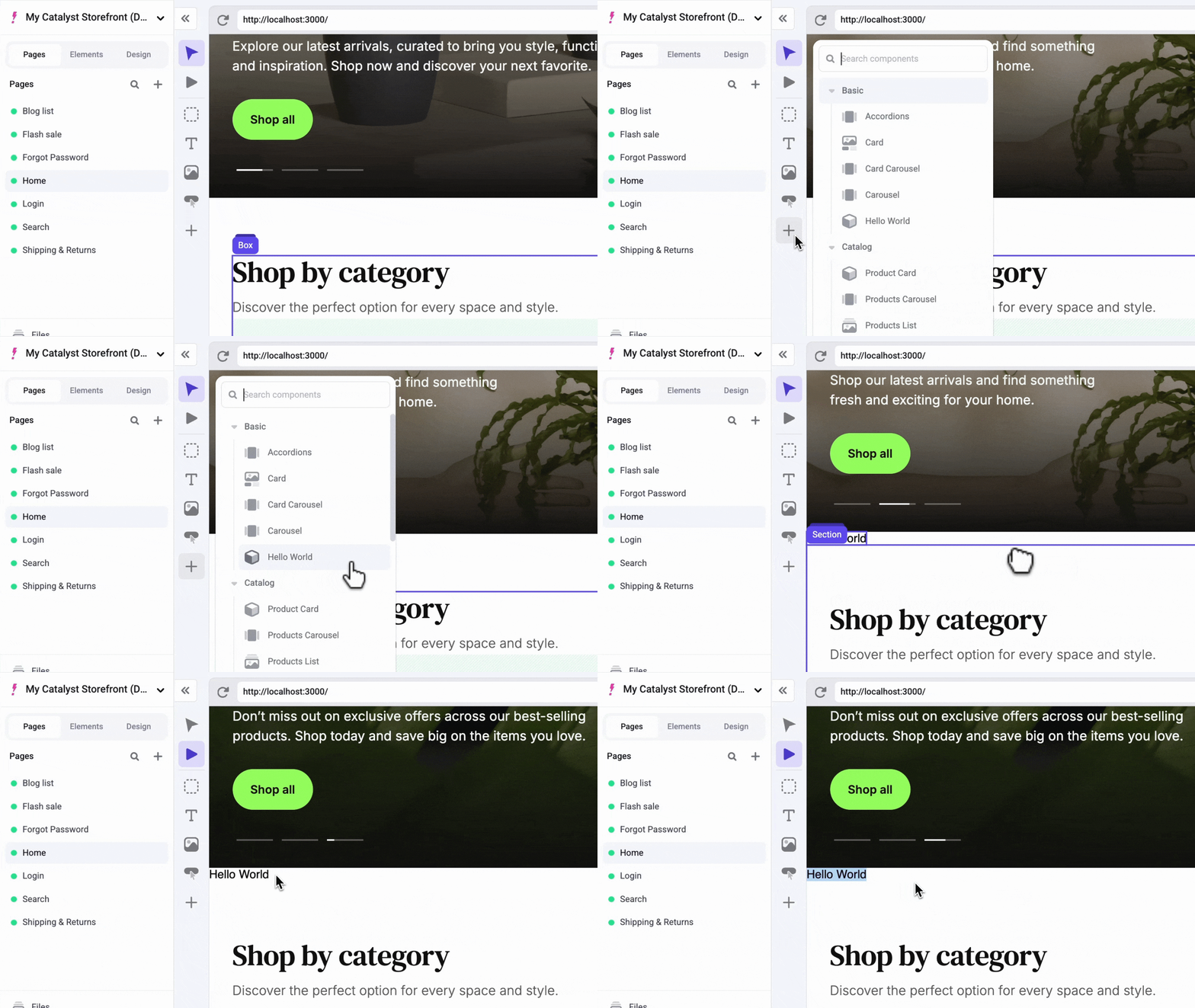
Hello World in Makeswift

Props and controls

Before turning HelloWorld into a product carousel, it helps to understand two concepts: props and controls.

React components take props. For example, add a name string prop to components/hello-world/index.tsx:

components/hello-world/index.tsx
'use client';
export function HelloWorld({ name }: { name: string }) {
return <div>Hello {name}</div>;
}

Because name is required, TypeScript now reports in the registration file that name isn’t defined as a Makeswift control. The props property of registerComponent’s configuration object is where you define controls. Add a TextInput control for the name prop:

lib/makeswift/components/hello-world/register.ts
import { TextInput } from '@makeswift/runtime/controls';
import { runtime } from '~/lib/makeswift/runtime';
import { HelloWorld } from '~/components/hello-world';
runtime.registerComponent(HelloWorld, {
type: 'hello-world',
label: 'Basic / Hello World',
props: {
name: TextInput({
label: 'Name',
defaultValue: 'World',
}),
},
});

registerComponent uses TypeScript to map each entry in the props object to a prop of the React component. Every time you add a Makeswift control, make sure the registered component has a prop with the same name.

Reload the Makeswift editor, click the component, and edit the name prop. Makeswift users can change your site through whichever props you expose to them as controls.
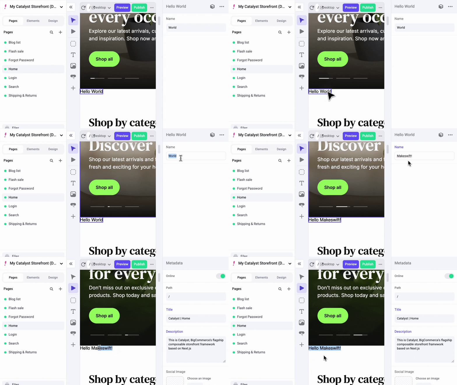
Edit Hello World in Makeswift

Create the MyProductCarousel component

Follow a similar process to create a MyProductCarousel component. Instead of building the carousel UI from scratch, use the ProductCarousel component in VIBES, which is already included in the Catalyst source code.

Like HelloWorld, this component has to be a Client Component, and it also fetches products with a React hook. Registration files are imported from server code, so keep the component and its registration in separate files, the same way Catalyst’s built-in products-carousel component does:

  • client.tsx, marked with 'use client', holds the React component.
  • register.ts imports that component and registers it with Makeswift.

Create the folder and both files:

mkdir lib/makeswift/components/my-product-carousel
touch lib/makeswift/components/my-product-carousel/client.tsx
touch lib/makeswift/components/my-product-carousel/register.ts

Create the wrapper component

In client.tsx, import the ProductCarousel and ProductsCarouselSkeleton components from VIBES (@/vibes/soul/sections/product-carousel). Unlike HelloWorld, ProductCarousel takes a number of props, including the required products prop.

Create a wrapper component, MSMyProductCarousel, that fetches product data, shows a skeleton loader while it loads, checks the result, and passes the products to ProductCarousel:

lib/makeswift/components/my-product-carousel/client.tsx
'use client';
import { ProductCarousel, ProductsCarouselSkeleton } from '@/vibes/soul/sections/product-carousel';
import { useProducts } from '../../utils/use-products';
export function MSMyProductCarousel() {
const { products, isLoading } = useProducts({
collection: 'featured',
additionalProductIds: [],
});
if (isLoading) {
return <ProductsCarouselSkeleton />;
}
if (products == null || products.length === 0) {
return <ProductsCarouselSkeleton />;
}
return <ProductCarousel className="w-full" products={products} />;
}

Then, register the wrapper in register.ts, the same way you registered HelloWorld:

lib/makeswift/components/my-product-carousel/register.ts
import { runtime } from '~/lib/makeswift/runtime';
import { MSMyProductCarousel } from './client';
runtime.registerComponent(MSMyProductCarousel, {
type: 'my-product-carousel',
label: 'Catalog / My Product Carousel',
});

The wrapper doesn’t take props yet, so collection and additionalProductIds are hard-coded. Whenever you build a component that takes props, decide which of them should be editable in Makeswift. Later steps add Makeswift controls for collection and additionalProductIds so authors can change them without editing code.

The useProducts hook fetches product data with a client-side request to a proxy API endpoint, /api/products/group/${collection}. The hook runs only in the browser, and Catalyst calls the GraphQL Storefront API server-to-server, so the browser can’t call it directly; it requests data through an API route instead. If your own client-side Makeswift components need BigCommerce data, create a proxy API endpoint for that data.

Import the new registration file in lib/makeswift/components.ts, under the import for hello-world:

lib/makeswift/components.ts
// ...
import './components/hello-world/register';
import './components/my-product-carousel/register';

In Makeswift, drag a box above the “Shop by category” section, and then drag the MyProductCarousel component from the component tray into it.
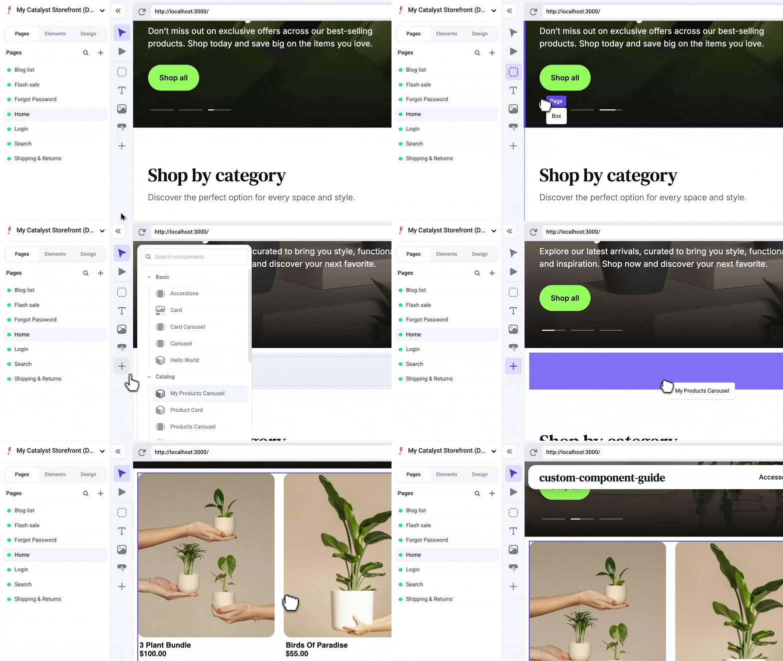
My Product Carousel in Makeswift

If the carousel shows no products, the featured collection is empty. Mark some products as featured in your BigCommerce channel settings, or try changing the collection prop to best-selling or newest.

Add the style control

Add the component’s first Makeswift control, Style(). First, update the component to accept a className prop:

lib/makeswift/components/my-product-carousel/client.tsx
'use client';
import { ProductCarousel, ProductsCarouselSkeleton } from '@/vibes/soul/sections/product-carousel';
import { useProducts } from '../../utils/use-products';
interface MSMyProductCarouselProps {
className: string;
}
export function MSMyProductCarousel({ className }: MSMyProductCarouselProps) {
const { products, isLoading } = useProducts({
collection: 'featured',
additionalProductIds: [],
});
if (isLoading) {
return <ProductsCarouselSkeleton className={className} />;
}
if (products == null || products.length === 0) {
return <ProductsCarouselSkeleton className={className} />;
}
return <ProductCarousel className={className} products={products} />;
}

The new MSMyProductCarouselProps interface defines the component’s props, starting with className.

Then, add the Style() control for className in the registration file:

lib/makeswift/components/my-product-carousel/register.ts
import { Style } from '@makeswift/runtime/controls';
import { runtime } from '~/lib/makeswift/runtime';
import { MSMyProductCarousel } from './client';
runtime.registerComponent(MSMyProductCarousel, {
type: 'my-product-carousel',
label: 'Catalog / My Product Carousel',
props: {
className: Style(),
},
});

Reload the Makeswift editor, click the component, and adjust its width, height, and other style properties in the right sidebar:
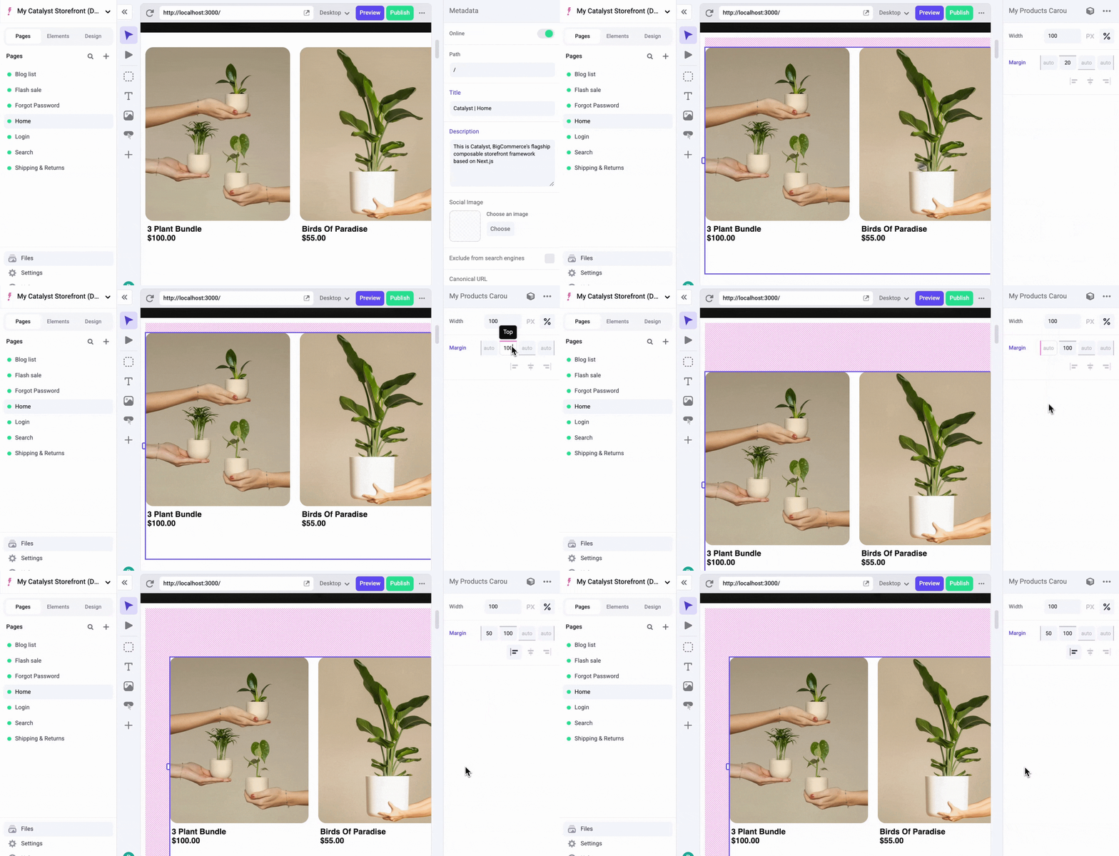
My Product Carousel in Makeswift

Add a collection control

Next, give authors a dropdown in the Makeswift editor to choose which collection the carousel displays.

Add a collection property to the interface, typed as a union of the valid values. Then replace the hard-coded collection value passed to useProducts with the new prop:

lib/makeswift/components/my-product-carousel/client.tsx
'use client';
import { ProductCarousel, ProductsCarouselSkeleton } from '@/vibes/soul/sections/product-carousel';
import { useProducts } from '../../utils/use-products';
interface MSMyProductCarouselProps {
className: string;
collection: 'featured' | 'best-selling' | 'newest' | 'none';
}
export function MSMyProductCarousel({ className, collection }: MSMyProductCarouselProps) {
const { products, isLoading } = useProducts({
collection,
additionalProductIds: [],
});
if (isLoading) {
return <ProductsCarouselSkeleton className={className} />;
}
if (products == null || products.length === 0) {
return <ProductsCarouselSkeleton className={className} />;
}
return <ProductCarousel className={className} products={products} />;
}

Then, import the Select() control, and make sure each option’s value matches a string in the collection union type:

lib/makeswift/components/my-product-carousel/register.ts
import { Select, Style } from '@makeswift/runtime/controls';
import { runtime } from '~/lib/makeswift/runtime';
import { MSMyProductCarousel } from './client';
runtime.registerComponent(MSMyProductCarousel, {
type: 'my-product-carousel',
label: 'Catalog / My Product Carousel',
props: {
className: Style(),
collection: Select({
label: 'Product collection',
options: [
{ value: 'none', label: 'None (static only)' },
{ value: 'best-selling', label: 'Best selling' },
{ value: 'newest', label: 'Newest' },
{ value: 'featured', label: 'Featured' },
],
defaultValue: 'featured',
}),
},
});

Add more product IDs

Now do the same for additionalProductIds. This one takes a few more steps. In the component, accept an additionalProducts list and map it to product IDs:

lib/makeswift/components/my-product-carousel/client.tsx
'use client';
import { ProductCarousel, ProductsCarouselSkeleton } from '@/vibes/soul/sections/product-carousel';
import { useProducts } from '../../utils/use-products';
interface MSMyProductCarouselProps {
className: string;
collection: 'featured' | 'best-selling' | 'newest' | 'none';
additionalProducts: Array<{
entityId?: string;
}>;
}
export function MSMyProductCarousel({
className,
collection,
additionalProducts,
}: MSMyProductCarouselProps) {
const additionalProductIds = additionalProducts.map(({ entityId }) => entityId ?? '');
const { products, isLoading } = useProducts({
collection,
additionalProductIds,
});
if (isLoading) {
return <ProductsCarouselSkeleton className={className} />;
}
if (products == null || products.length === 0) {
return <ProductsCarouselSkeleton className={className} />;
}
return <ProductCarousel className={className} products={products} />;
}

In the registration file, compose several controls (List(), Group(), TextInput(), and Combobox()) to give authors a usable editor:

lib/makeswift/components/my-product-carousel/register.ts
import { Combobox, Group, List, Select, Style, TextInput } from '@makeswift/runtime/controls';
import { runtime } from '~/lib/makeswift/runtime';
import { searchProducts } from '../../utils/search-products';
import { MSMyProductCarousel } from './client';
runtime.registerComponent(MSMyProductCarousel, {
type: 'my-product-carousel',
label: 'Catalog / My Product Carousel',
props: {
className: Style(),
collection: Select({
label: 'Product collection',
options: [
{ value: 'none', label: 'None (static only)' },
{ value: 'best-selling', label: 'Best selling' },
{ value: 'newest', label: 'Newest' },
{ value: 'featured', label: 'Featured' },
],
defaultValue: 'featured',
}),
additionalProducts: List({
label: 'Additional products',
type: Group({
label: 'Product',
props: {
title: TextInput({ label: 'Title', defaultValue: 'Product title' }),
entityId: Combobox({
label: 'Product',
async getOptions(query) {
const products = await searchProducts(query);
return products.map((product) => ({
id: product.entityId.toString(),
label: product.name,
value: product.entityId.toString(),
}));
},
}),
},
}),
getItemLabel(product) {
return product?.title || 'Product';
},
}),
},
});

Each control serves a different purpose. For details, see the Makeswift controls reference.

This uses a second utility function that fetches product data from a proxy API endpoint. The two serve different purposes: the React hook fetches the products the component renders, while the function in getOptions fetches the options shown when an author types in the combobox to add a product to the carousel.

getItemLabel makes the List() items under “Additional products” more readable. It receives each item in the list, and here returns the item’s Title.

Add a limit control

Next, let authors control how many products the carousel shows. Following the same pattern, add a limit prop to the interface and use it in the component to limit the number of products returned:

lib/makeswift/components/my-product-carousel/client.tsx
'use client';
import { ProductCarousel, ProductsCarouselSkeleton } from '@/vibes/soul/sections/product-carousel';
import { useProducts } from '../../utils/use-products';
interface MSMyProductCarouselProps {
className: string;
collection: 'featured' | 'best-selling' | 'newest' | 'none';
limit: number;
additionalProducts: Array<{
entityId?: string;
}>;
}
export function MSMyProductCarousel({
className,
collection,
limit,
additionalProducts,
}: MSMyProductCarouselProps) {
const additionalProductIds = additionalProducts.map(({ entityId }) => entityId ?? '');
const { products, isLoading } = useProducts({
collection,
collectionLimit: limit,
additionalProductIds,
});
if (isLoading) {
return <ProductsCarouselSkeleton className={className} />;
}
if (products == null || products.length === 0) {
return <ProductsCarouselSkeleton className={className} />;
}
return <ProductCarousel className={className} products={products} />;
}

Then, bring in the Number() control from the Makeswift runtime to tell Makeswift how to provide a value for limit:

lib/makeswift/components/my-product-carousel/register.ts
import {
Combobox,
Group,
List,
Number,
Select,
Style,
TextInput,
} from '@makeswift/runtime/controls';
import { runtime } from '~/lib/makeswift/runtime';
import { searchProducts } from '../../utils/search-products';
import { MSMyProductCarousel } from './client';
runtime.registerComponent(MSMyProductCarousel, {
type: 'my-product-carousel',
label: 'Catalog / My Product Carousel',
props: {
className: Style(),
collection: Select({
label: 'Product collection',
options: [
{ value: 'none', label: 'None (static only)' },
{ value: 'best-selling', label: 'Best selling' },
{ value: 'newest', label: 'Newest' },
{ value: 'featured', label: 'Featured' },
],
defaultValue: 'featured',
}),
limit: Number({ label: 'Max collection items', defaultValue: 12 }),
additionalProducts: List({
label: 'Additional products',
type: Group({
label: 'Product',
props: {
title: TextInput({ label: 'Title', defaultValue: 'Product title' }),
entityId: Combobox({
label: 'Product',
async getOptions(query) {
const products = await searchProducts(query);
return products.map((product) => ({
id: product.entityId.toString(),
label: product.name,
value: product.entityId.toString(),
}));
},
}),
},
}),
getItemLabel(product) {
return product?.title || 'Product';
},
}),
},
});

Update the types

The VIBES ProductCarousel prop interface defines many props, such as aspectRatio and colorScheme, that MSMyProductCarouselProps doesn’t include yet.

For each component you build for Makeswift, decide which of its props authors should be able to edit. Here, authors should be able to control almost every ProductCarousel prop, such as whether the carousel showsButtons or hides its overflow.

Instead of adding each prop to MSMyProductCarouselProps by hand, use React’s ComponentPropsWithoutRef utility type. It extracts a component’s prop types without its ref-related props, giving you a type that matches the component’s public interface.

Change the MSMyProductCarouselProps definition in client.tsx to use it:

lib/makeswift/components/my-product-carousel/client.tsx
'use client';
import { ComponentPropsWithoutRef } from 'react';
// ...
type MSMyProductCarouselProps = ComponentPropsWithoutRef<typeof ProductCarousel> & {
className: string;
collection: 'featured' | 'best-selling' | 'newest' | 'none';
limit: number;
additionalProducts: Array<{
entityId?: string;
}>;
};
// ...

MSMyProductCarouselProps now accepts any prop ProductCarousel accepts, plus collection and additionalProducts.

TypeScript now reports Property 'products' is missing in type …. ProductCarousel requires a products prop, but MSMyProductCarousel doesn’t take one, because the wrapper fetches products itself. Use TypeScript’s Omit utility type to remove products from the type:

lib/makeswift/components/my-product-carousel/client.tsx
// ...
type MSMyProductCarouselProps = Omit<
ComponentPropsWithoutRef<typeof ProductCarousel>,
'products'
> & {
className: string;
collection: 'none' | 'best-selling' | 'newest' | 'featured';
limit: number;
additionalProducts: Array<{
entityId?: string;
}>;
};
// ...

The TypeScript errors are gone, and MSMyProductCarousel accepts any prop that ProductCarousel accepts. To confirm, remove className from MSMyProductCarouselProps: TypeScript doesn’t report an error, because className is already a ProductCarousel prop and the wrapper’s type extends those props.

Additional controls

Now pass the rest of the props through to ProductCarousel:

lib/makeswift/components/my-product-carousel/client.tsx
'use client';
import { ComponentPropsWithoutRef } from 'react';
import { ProductCarousel, ProductsCarouselSkeleton } from '@/vibes/soul/sections/product-carousel';
import { useProducts } from '../../utils/use-products';
type MSMyProductCarouselProps = Omit<
ComponentPropsWithoutRef<typeof ProductCarousel>,
'products'
> & {
collection: 'none' | 'best-selling' | 'newest' | 'featured';
limit: number;
additionalProducts: Array<{
entityId?: string;
}>;
};
export function MSMyProductCarousel({
className,
collection,
limit,
additionalProducts,
...props
}: MSMyProductCarouselProps) {
const additionalProductIds = additionalProducts.map(({ entityId }) => entityId ?? '');
const { products, isLoading } = useProducts({
collection,
collectionLimit: limit,
additionalProductIds,
});
if (isLoading) {
return <ProductsCarouselSkeleton className={className} />;
}
if (products == null || products.length === 0) {
return <ProductsCarouselSkeleton className={className} />;
}
return <ProductCarousel {...props} className={className} products={products} />;
}

Then, add controls to fill in the rest of our props:

lib/makeswift/components/my-product-carousel/register.ts
import {
Checkbox,
Combobox,
Group,
List,
Number,
Select,
Style,
TextInput,
} from '@makeswift/runtime/controls';
import { runtime } from '~/lib/makeswift/runtime';
import { searchProducts } from '../../utils/search-products';
import { MSMyProductCarousel } from './client';
runtime.registerComponent(MSMyProductCarousel, {
type: 'my-product-carousel',
label: 'Catalog / My Product Carousel',
props: {
className: Style(),
collection: Select({
label: 'Product collection',
options: [
{ value: 'none', label: 'None (static only)' },
{ value: 'best-selling', label: 'Best selling' },
{ value: 'newest', label: 'Newest' },
{ value: 'featured', label: 'Featured' },
],
defaultValue: 'featured',
}),
limit: Number({ label: 'Max collection items', defaultValue: 12 }),
additionalProducts: List({
label: 'Additional products',
type: Group({
label: 'Product',
props: {
title: TextInput({ label: 'Title', defaultValue: 'Product title' }),
entityId: Combobox({
label: 'Product',
async getOptions(query) {
const products = await searchProducts(query);
return products.map((product) => ({
id: product.entityId.toString(),
label: product.name,
value: product.entityId.toString(),
}));
},
}),
},
}),
getItemLabel(product) {
return product?.title || 'Product';
},
}),
aspectRatio: Select({
label: 'Aspect ratio',
options: [
{ value: '1:1', label: 'Square' },
{ value: '5:6', label: '5:6' },
{ value: '3:4', label: '3:4' },
],
defaultValue: '5:6',
}),
colorScheme: Select({
label: 'Text color scheme',
options: [
{ value: 'light', label: 'Light' },
{ value: 'dark', label: 'Dark' },
],
defaultValue: 'light',
}),
showScrollbar: Checkbox({
label: 'Show scrollbar',
defaultValue: true,
}),
showButtons: Checkbox({
label: 'Show buttons',
defaultValue: true,
}),
hideOverflow: Checkbox({
label: 'Hide overflow',
defaultValue: true,
}),
},
});

All of the props are now exposed in Makeswift for authors to control.
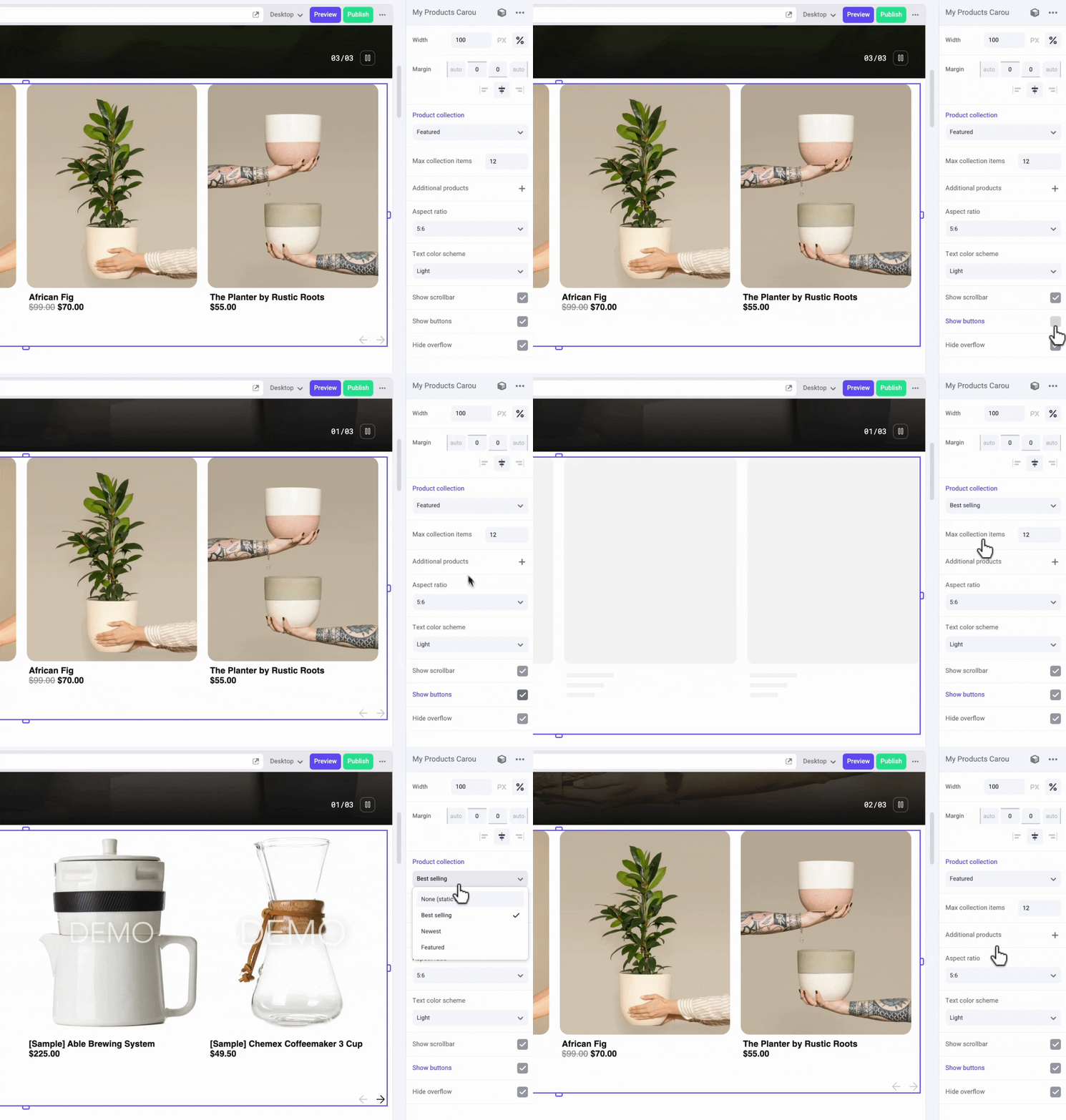
My Product Carousel in Makeswift

For a complete reference implementation, compare your component with Catalyst’s built-in lib/makeswift/components/products-carousel component, which follows the same structure.

Next steps

You’ve built a Catalyst component that authors can edit visually in Makeswift, that sources data from your BigCommerce catalog, and that combines VIBES UI components with Next.js primitives.