type | string | The type of setting component to display. | ”element” |
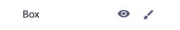
label | string | The user friendly message to inform the user how this setting will be used. | ”Box” |
id | string | The variable name where the setting value will be available in the widget template. | ”textBox” |
typeMeta | object | Additional information needed based on the selected setting type. | |
typeMeta.controls | object | Contains the visibility and advanced attributes. | |
typeMeta.controls.visibility | object | Displays an eyeball icon that toggles widget visibility. | |
typeMeta.controls.visibility.default | string | The default value to use when rendering the widget for the first time. | ”show” |
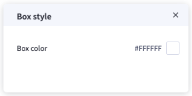
typeMeta.controls.advanced | object | Contains a list of settings that are displayed when the user clicks the brush icon. | |
typeMeta.controls.advanced.label | string | The user friendly message to inform the user how this setting will be used. | ”Box style” |
typeMeta.controls.advanced.settings | array | Include additional settings | |
typeMeta.controls.advanced.settings[].type | string | The type of setting component to display. | ”color” |
typeMeta.controls.advanced.settings[].label | string | The user friendly message to inform the user how this setting will be used. | ”Box color” |
typeMeta.controls.advanced.settings[].id | string | The variable name where the setting value will be available in the widget template. | ”backgroundColor” |
typeMeta.controls.advanced.settings[].default | string | The default value to use when rendering the widget for the first time. | ”#FFFFFF” |