Skip to navigation

Optimized One-Page Checkout

This article covers styling and display options for Optimized One-Page Checkout.

Working with the optimized checkout SCSS file

Cornerstone includes a SCSS file that styles the Optimized Checkout page. In your local installation, this file is located at cornerstone/assets/scss/optimized-checkout.scss.

You can access the most recent version of this file in the Cornerstone repository. All themes share the same stylesheet for the Optimized One-Page checkout, even those not based on Cornerstone, so this stylesheet applies universally across Stencil themes.

On a headless channel, the control panel hides the Themes section. To reach this file, see Accessing Checkout Theme Files.

Customizing checkout restrictions

When customizing the checkout page, you are free to change classes’ contents; however, do not nest elements, change any class names, or use class selectors other than those provided in the file. BigCommerce imposes these restrictions because each class here maps to multiple optimized checkout elements. Changing the structure or naming would break updates available in future optimized checkout enhancements.

Configuring the desktop viewport

To set up optimized checkout’s responsive features within the optimized-checkout.scss file, you should configure the following breakpoint to define your preferred desktop viewport size. The media query is nested inside .optimizedCheckout-header and applies the optimizedCheckout-logo-position theme setting to align the header logo at desktop widths (801px and wider by default):

.optimizedCheckout-header {
// TODO:
// Configure media query to be 'desktop' breakpoint size
// -----------------------------------------------------------------------------
@media (min-width: 801px) {
text-align: stencilString("optimizedCheckout-logo-position");
}
}

Classes available for customization

Below are the classes provided in Cornerstone’s optimized-checkout.scss, with the corresponding page elements that they style. These class names and mappings are subject to change, so please check the inline comments in the optimized-checkout.scss file that you downloaded with your current Cornerstone release.

ClassStyles this Optimized One-Page Checkout element
*:focusOutline color of any element that has keyboard focus.
.optimizedCheckout-headerPage header – background color, background image, border color, text color, and logo position.
.optimizedCheckout-headingPrimaryTop-level headings.
.optimizedCheckout-headingSecondaryCertain lower-level elements, such as descriptions of cart items.
bodyPage background color.
.optimizedCheckout-overlayShipping Method box.
.optimizedCheckout-contentPrimaryBody text in the Order Summary/Order Confirmation (cart contents); drop-down-list items; and text that summarizes completed steps.
.optimizedCheckout-contentSecondaryText labels on check boxes, and lower-level text in the Order Summary.
.optimizedCheckout-buttonPrimaryCONTINUE button for each step and the final PAY button, including hover, focus, active, and disabled states.
.optimizedCheckout-buttonSecondaryEdit button for each step, including hover, focus, active, and disabled states.
aLink text color and typography, including the hover color.
.optimizedCheckout-orderSummaryBackground, border, and shadow colors in the Order Summary mobile drawer/modal.
.optimizedCheckout-orderSummary-cartSectionBorder color of the cart sections in the Order Summary.
.optimizedCheckout-checkoutStepBorder color of each checkout step.
.optimizedCheckout-stepLarge step-number indicators on the page’s left side.
.optimizedCheckout-form-labelStyles form fields like Email Address – the field’s text-label color.
.form-field--errorError color applied to form-field labels and inline error messages.
.optimizedCheckout-form-inputStyles form fields like Email Address – the entry box’s background, border, shadow, text, and placeholder colors, including focus and error states.
.optimizedCheckout-form-selectDrop-down lists – the same background, border, shadow, text, and placeholder colors as .optimizedCheckout-form-input, including focus, hover, and error states.
.optimizedCheckout-form-radioRadio buttons – background, border, and shadow colors, including checked and focus states.
.optimizedCheckout-form-checkboxCheck boxes – background, border, and shadow colors, including checked and focus states.
.optimizedCheckout-discountBannerDiscount banners – background, text, and icon colors, and typography.
.optimizedCheckout-form-checklistShipping and payment method lists – background, border, and text colors.
.optimizedCheckout-form-checklist-itemIndividual items in the shipping and payment method lists.
.optimizedCheckout-form-checklist-item--selectedThe selected (or hovered) item in the shipping and payment method lists.
.optimizedCheckout-form-checklist-checkboxRadio-style selectors in the shipping and payment method lists, including checked and focus states.
.optimizedCheckout-loadingToasterLoading toaster – background and text colors.

Enhanced checkout styles

When the Enhanced Checkout option is enabled in the control panel, checkout applies the .enhancedThemeV1 class. Cornerstone’s optimized-checkout.scss scopes a set of overrides to this class so that the enhanced checkout UI, including dark theme variations, uses your existing optimizedCheckout-* theme settings.

Selector within .enhancedThemeV1Styles this enhanced checkout element
.enhancedThemeV1Page background – uses the optimizedCheckout-header-backgroundColor setting.
.optimizedCheckout-form-checklist-checkbox:checked ~ .optimizedCheckout-form-labelSelected radio indicator in the shipping and payment method lists – uses the optimizedCheckout-formChecklist-color setting, with an inner dot in the optimizedCheckout-formField-backgroundColor setting.
.optimizedCheckout-form-checklist-itemBorder color of items in the shipping and payment method lists.
.optimizedCheckout-form-checklist-item--selectedSelected list item – border in the optimizedCheckout-formChecklist-color setting and background in the optimizedCheckout-formChecklist-backgroundColorSelected setting.
.optimizedCheckout-checkoutStepCheckout steps – a semi-transparent version of the body background color.
.optimizedCheckout-checkoutStep.checkout-step--currentThe current checkout step – the full body background color.
.optimizedCheckout-checkoutStep:not(.checkout-step--current) .optimizedCheckout-buttonSecondaryEdit buttons on steps that are not current – a transparent background.
.optimizedCheckout-orderSummary-toggleOrder Summary toggle – text and icon use the optimizedCheckout-link-color setting.

Providing customizable options in Page Builder

You can determine which aspects of Optimized One-Page Checkout merchants will customize with the Page Builder tool.

In Cornerstone’s optimized-checkout.scss, each SCSS class and property available has a corresponding key/value pair in the config.json file, which can be used as the id value in schema.json when creating customizable Page Builder options.

Currency conversion options

You can enable the display of alternate currencies on your Stencil theme’s Optimized One-Page Checkout and order confirmation pages.

Restrictions

The options on this page require that you first enable Optimized One-Page Checkout. Find instructions on how to do this in Optimized One-Page Checkout.

Note that regardless of the display options you set below, you will always process transactions in the store’s single default currency. To change that setting, see Changing Your Default Currency.

To allow shoppers to view prices in multiple currencies, you will need to add the desired currencies in the store control panel.

Shoppers will then be able to use the Currency drop-down list throughout the storefront to switch displayed prices among the enabled currencies.

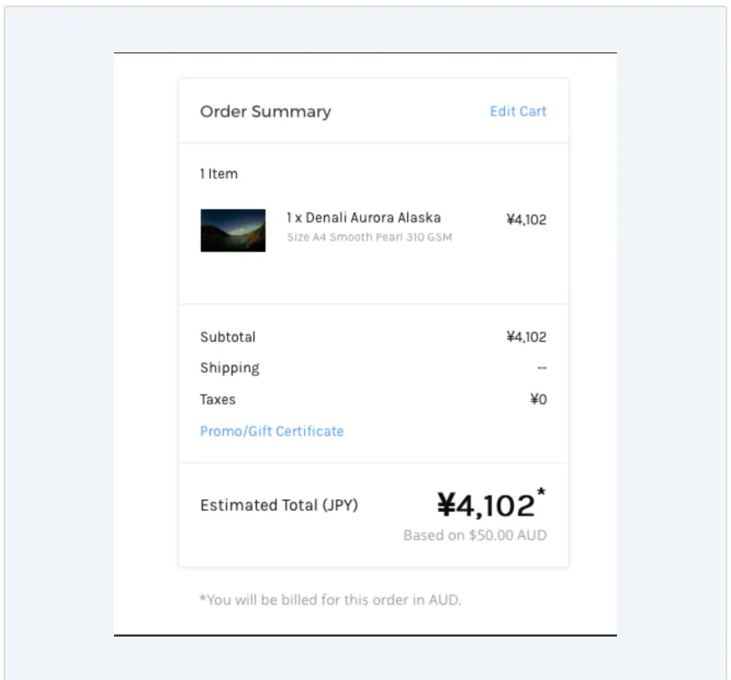
At checkout, the shopper still receives the bill in the store’s default currency. As shown below, the checkout and cart templates will show an annotation about this while flagging any converted total (in a shopper’s selected alternate currency) as an Estimated Total:
checkout template