

Developing Accessible Themes
Designing for accessibility means being inclusive to the needs of all users. This article outlines the basic accessibility requirements BigCommerce would recommend for all themes.
We have included four accessibility best practices and examples that will help you develop a theme that meets the needs of the broadest range of abilities.
Prerequisites
- A BigCommerce store.
- A store theme. (The following examples use the Cornerstone theme.)
Image alt text
Alternative (alt) text is an image description read aloud by a screen reader. Adding alt text increases the content’s accessibility to visually-impaired users. All HTML <img> elements should use the alt attribute to provide a text description of the image.
Alt image text using HTML
In Cornerstone, go to templates/components/common/store-logo.html. In the <img> tag, provide descriptive alt text for your store logo.
You can update the title attribute with the same text as the alt attribute to create a tooltip, or remove it if you do not need it.
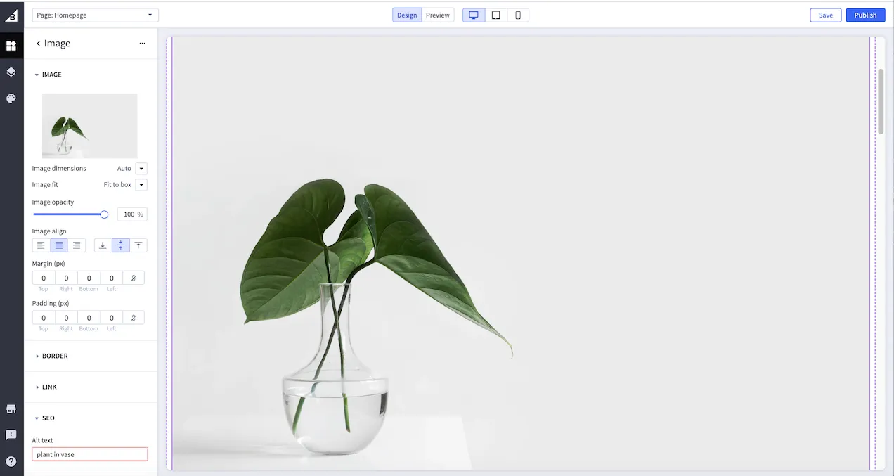
Alt image text in Page Builder
You can add alt text to the <img> element in the Image widget of Page Builder or the cornerstone/assets/img/ directory.
Follow the steps below to add alt text to an image using Page Builder:
- Go to Storefront > My theme in the control panel, then click Customize.
- Launch Page Builder and select the image widget.
- Enter the alt text.
- Click Save.
Aria-label attribute
There are other options for providing text for images. Developers can use the aria-label attribute, a Web Content Accessibility Guidelines (WCAG) technique that provides assistive technology with the aria-label text instead of the image alt text.
The aria-label attribute uses an ID reference value that matches the ID element attribute to associate an element with text. Screen readers use the text of one or more identified elements that can be referenced elsewhere on the page.
Popup modal text example
In Cornerstone, put the following code at the bottom of your stencil template HTML:
Add a button on your page and use the following code:
Text accessibility
Text accessibility involves making content readable and understandable. You can achieve text accessibility using the following methods:
Color contrast
Color contrast is an essential factor in visual accessibility.
According to WCAG 2.1, your ecommerce website must have minimum color contrast ratios of 4.5.1 for standard text and 3:1 for large text. To ensure you meet WCAG 2.1 guidelines, we recommend presetting these guidelines, using Lighthouse or Chrome’s Accessibility Developer Tools.
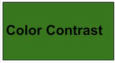
It is essential to avoid using dark colors for both the background and text color. Instead, use contrasting colors to achieve better visibility. For example, avoid green and black, green and gray, and green and red background and text colors. Alternatively, it is good practice to use light text on dark backgrounds or dark text on light backgrounds. The example below shows poor color contrasting because the black text is on a green background. The color contrast ratio is 3.8.1. It would have been better to use white text on a dark green background.
Poor contrast ratio
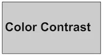
The following example displays black text on a gray background, which demonstrates good color contrast. The contrast ratio is 14.9.1, which meets WCAG guidelines.
Good contrast ratio
Headings
Text headings organize and provide structure for a page, helping users to understand its contents. Headings should be logical, clear, and concise. The following example shows which heading structures should be used or avoided.
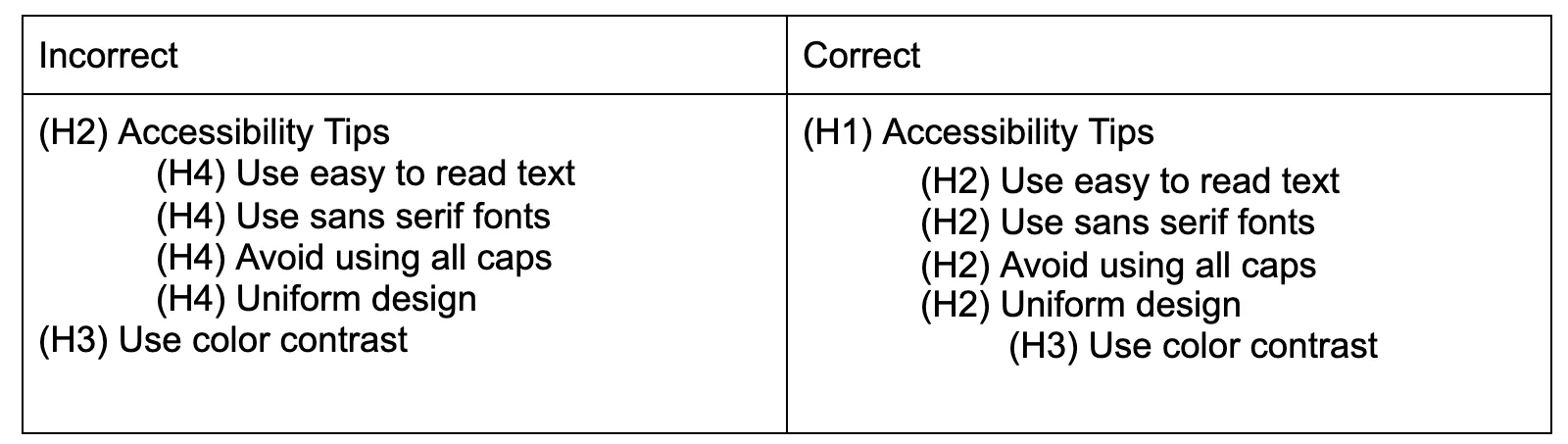
Your main heading should be H1 and indicate the main content. The incorrect example displays the main heading as H2, which you should only use for subtopics. Avoid breaking the headings sequence to prevent a fragmented accessibility experience.
The correct structure displayed above on the right shows heading levels from largest to smallest communicating more specific information about the previous section.
For an example video on how to create text headings, see How Headings Help Screen Reader Users.
Font size and text alignment
The use of white space around blocks of text makes it easier to read. We recommend the following text formatting:
- Left-aligned text
- Font size of 14px
- 55-65 characters per line
- Sans-serif fonts
Non-compliant font size and alignment
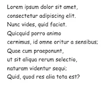
The following example demonstrates non-compliant usage of font size and text alignment. The non-compliant example shows 25-40 characters per line, uses Comic Sans MS, and is 11px. The sentences are short and choppy which results in a poor reading experience.
Compliant font-size and alignment
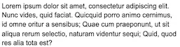
The WCAG compliant example uses the recommended font size of 14px, has 55-65 characters per line, and uses Arial font. This example promotes readability and white space is balanced.
To learn more about font size and alignment needed for accessibility, see the WebAIM article on Typefaces and Fonts.
Text links
Text links should be unique within a page and meaningful when read out of context.
The following example demonstrates how you can make link text meaningful.
Don’t use “click here” for the linked text. Instead, use the exact title of a linked page or use a description of the linked page. You may need to rework a sentence to make the text meaningful.
Additional linked text recommendations:
- Use unique link text where possible.
- Avoid using a URL as the link text; consider using the page title or description of the page.
- Don’t use the word “link” in your link text.
- Don’t capitalize links unless the title of the linked page is capitalized.
- Keep link text concise.
- Don’t link directly to downloads.
- Provide a warning when link text opens a new window.
- Remove broken or empty links.
Keyboard accessibility
Keyboard accessibility involves making a theme accessible without the use of a mouse. Ensure you can navigate to all links, menus, buttons, and form fields using the keyboard.
To test a page’s keyboard accessibility, press the Tab key and navigate from the top of the page to the bottom. The navigation order must be logical and intuitive.
To enable an element to participate in keyboard navigation, use the tabindex global attribute.
To see tabindex in action, open the following example in a new tab: native-keyboard-accessibility.html.
Press the Tab key and navigate from the top of the page to the bottom, highlighting active elements. You can also use the arrow keys to scroll through the drop-down menu.
For an example video on keyboard accessibility, see Accessible Components: Keyboard access — Polycasts#49.
Customization
You can add scripts or code to improve the accessibility of your theme. As stated above, you can use the tabindex global attribute to add an element for keyboard navigation. Also, we suggest doing the following:
- Add a script or plugin to allow mobile, tablet, or desktop viewing. Use responsive design to match user technology to accommodate different zoom states and viewport sizes.
- Add multi-factor authentication or alternative methods besides CAPTCHA to verify identity. Visual CAPTCHA does not allow alt text, preventing visually impaired people from using it.
- Add hidden titles that can be accessed by a screen reader.
Menu button customization example
To update a menu button to add more color contrast, add the following text to the footer.html file of your mobile and regular templates:
There are many more customizations and changes you can make to increase your store’s accessibility; this article lists just a few. To learn more about accessibility, see the list of related resources below.
Related resources
For apps that can check and improve your site’s accessibility, see our Site Tools category in the App Marketplace.