

Enhance the User Experience with BigDesign
Step 4: Enhance the User Experience with BigDesign
BigDesign plays a pivotal part in the BigCommerce control panel and ecosystem. App developers are encouraged to use BigDesign to develop apps that have a native BigCommerce look and feel.
This step focuses on expanding functionality and integrating advanced design elements available as part of the BigDesign library.
Create the Products List route
-
From the
pages/apifolder, open theproductsfolder. -
In the
productsfolder, create alist.tsfile. Thelist.tsfile will be routed to/api/listand treated as an API endpoint, instead of a regular component. -
At the top of the file, import the following packages:
- Add the logic to call the Products endpoint of BigCommerce’s Catalog API. You can view list.ts (GitHub).
Update custom hooks
-
In the
libfolder, open thehooks.tsfile. -
Add the
isLoadingproperty to theuseProductscustom hook.
- Add the
useProductListcustom hook. You can view hooks.ts (GitHub).
Create the Products page
-
In the
pagesfolder, create aproductsfolder. -
In the
productsfolder, create anindex.tsxfile. -
At the top of the file, import the following packages:
Resolve Link namespace collision
Because BigDesign and Next.js both have a component called Link, you need to import BigDesign’s Link as StyledLink to avoid TypeScript errors.
- Add the
Productsfunctional component. TheProductscomponent uses the BigDesign’s StatefulTable, a wrapper of the Table component that supports pagination, row selection, and sorting. You can view index.tsx (GitHub).
Add the InnerHeader component
-
In the
componentsfolder, create aninnerHeader.tsxfile. -
At the top of the file, import the following packages:
- Define the
InnerHeaderfunctional component. You use it for the Product Edit page, a subpage ofproducts(/products/[pid]), whereas the mainHeadercomponent is used for the main pages such as/and/products. You can view innerHeader.tsx (GitHub).
The InnerHeader component uses BigDesign’s Button component with the variant property set to subtle. By setting the variant type to subtle, you remove the button’s border and simultaneously add a hover effect. To learn more about the BigDesign’s Button component, see Buttons Design Guidelines.
The ArrowBackIcon component is part of the BigDesign’s Icons package. You can modify the look of the icon by setting its color and size. To learn more about BigDesign’s Icons, see Icons.
Update the Header component
In this step, you incorporate the BigDesign’s Tabs component into your app. You use the Tabs component to organize and navigate between content types. To learn more, see Tabs Developer Docs.
- In the components folder, open the
header.tsxfile and update the imports.
- Declare
TabIds,TabRoutes,InnerRoutes, andHeaderTypesvariables.
- Update the
Headerfunctional component. You can view header.tsx (GitHub).
The Header functional component uses the useEffect React hook to perform side effects and enhance performance. Notably, performance enhancement is only visible in a production or production-like environment (integration or staging). router.prefetch() does not prefetch the products page while in the development mode.
Test your app
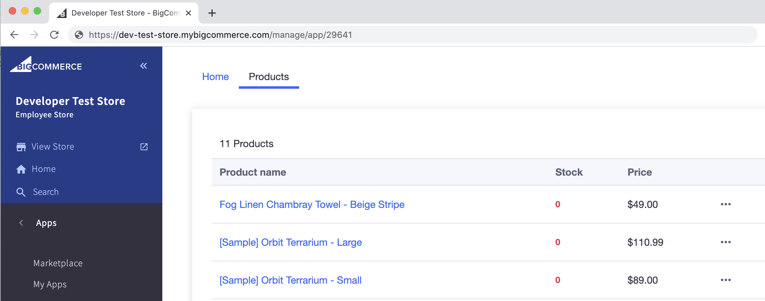
Your app should now display two tabs: Home and Products. Click on the Products tab. You should see a list of products from your test store.
Latency
When loading the products page for the first time, the latency you notice only happens in the development mode. In production or a production-like environment, router.prefetch() prefetches the products page reducing the latency.
To test your app in a production or a production-like environment (integration or staging), run npm run build instead of npm run dev in your terminal. This builds and compiles your local code. Then, run npm run start to get the performance enhancements traditionally not available in the development mode.
Keep in mind that any changes you make to your code after running npm run build need to go through the build process to be captured.
Create the ErrorMessage component
To surface error messages to the app’s users, add an error message component. You can call this component from any page or component.
-
In the
componentsfolder, add theerror.tsxfile. -
Copy and paste the following code to create the
ErrorMessagecomponent. You can view error.tsx (GitHub).
Create the Loading component
The Loading component makes use of the BigDesign’s indeterminant ProgressCircle indicator. The indeterminant ProgressCircle represents an unknown amount of time for a task to complete. To learn more about BigDesign’s progress indicators, see Progress Circle Developer Docs.
In the components folder, create a loading.tsx file. You can view loading.tsx (GitHub).
Add system checks
Now that you have created the ErrorMessage and Loading components, you can add them to the Products component.
-
In the
/pages/productsfolder, open theindex.tsxfile. -
Import the
ErrorMessageandLoadingcomponents.
- Inside the
Productsfunctional component, above thereturnstatement, add the logic to returnErrorMessageandLoadingcomponents.isLoadingchecks when the page or component is loading andisErrorchecks for API errors. You can view index.tsx (GitHub).
Update TypeScript definitions
-
In the
typesfolder, open thedata.tsfile. -
Export
FormDataandStringKeyValueTypeScript definitions. You can view data.ts (GitHub).
Create the Form component
You use the BigDesign’s Form component to display and edit individual product information.
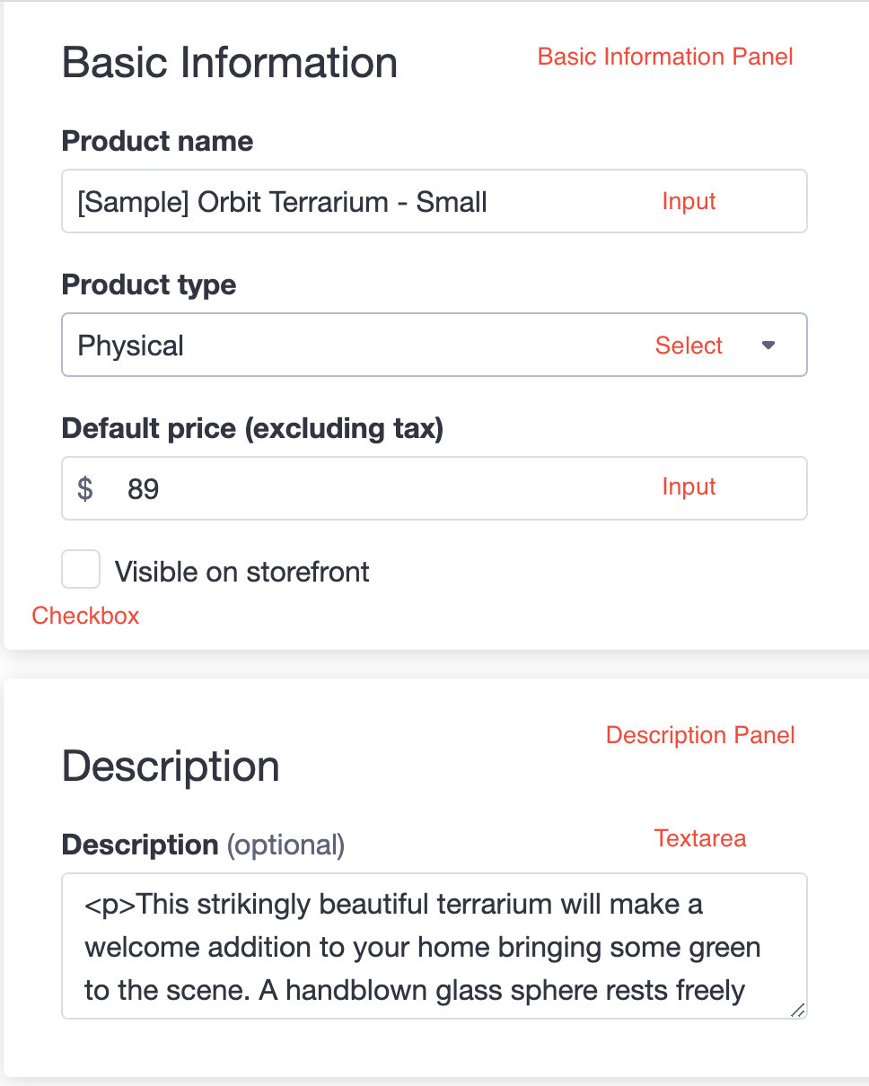
The BigDesign’s Form component comes with built-in support for accessibility, validation, and handling errors. It supports various input types, including Input, Checkbox, Radio, Select, and Textarea. To learn more, see Form Developer Docs.
-
In the
componentsfolder, add theform.tsxfile. -
At the top of the file, import the following packages:
- Add the
FormPropsTypeScript definition.
- Declare the
FormErrorsvariable.
- Declare and export the
Formfunctional component. You can view form.tsx (GitHub).
Create dynamic product routes
Next.js allows you to create dynamic routes by adding brackets to a page; for example, [pid]. Any route similar to products/123 or products/abc is matched by pages/products/[pid].tsx. To learn more about defining dynamic routes in Next.js, see Dynamic Routes.
-
Navigate to the
/pages/productsfolder and create a[pid].tsxfile. -
At the top of the file, import the following packages:
- Declare and export the
ProductInfofunctional component. You can view [pid].tsx (GitHub).
The ProductInfo functional component uses the Form component defined in /components/form. When you click on a product from the products list, it takes you to the corresponding page containing information about that particular product.
Avoid unnecessary Catalog API calls
Because you fetch all product data with the initial Catalog API call, you do not need to make additional calls to retrieve individual product data.
The following image illustrates the Form input types:
Integrate dynamic routes with the internal API
-
Navigate to the
/pages/api/productsfolder. -
In the
productsfolder, create a[pid].tsfile. -
At the top of the file, import the following packages:
- Add the function to update individual products based on the data passed in a
PUTrequest. You can view [pid].ts (GitHub).
Test your app
-
Pick a product from the products list and try changing its information such as name or price.
-
Save your changes. The changes should appear on the Products page.
Style the home page
-
In the
pagesfolder, open theindex.tsxfile. -
Update the imported packages.
- In the Flex component, extend the styles of the Box component by specifying the
border,borderRadius,marginRight, andpaddingattributes. Replace theTextcomponent withH4andH1components. To learn more about BigDesign’s typographic palette, see Typography. You can view index.tsx (GitHub).
Test your app
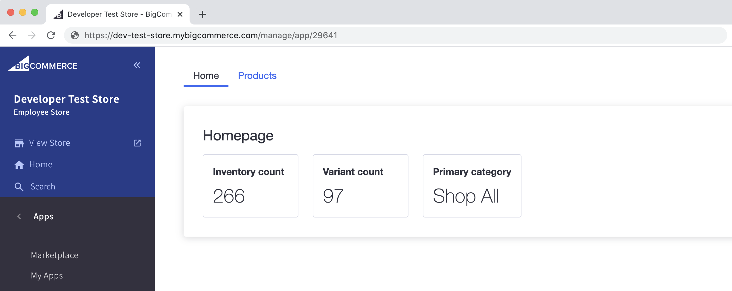
Your home page should now look similar to the following:
Start the app
To compile all of the production code for this project and start the app in the production environment, run the following commands in your terminal:
You should now have a fully functional app that pulls data from BigCommerce’s Catalog API and allows you to update each product individually, all in one convenient location.
Home page view
Products page view
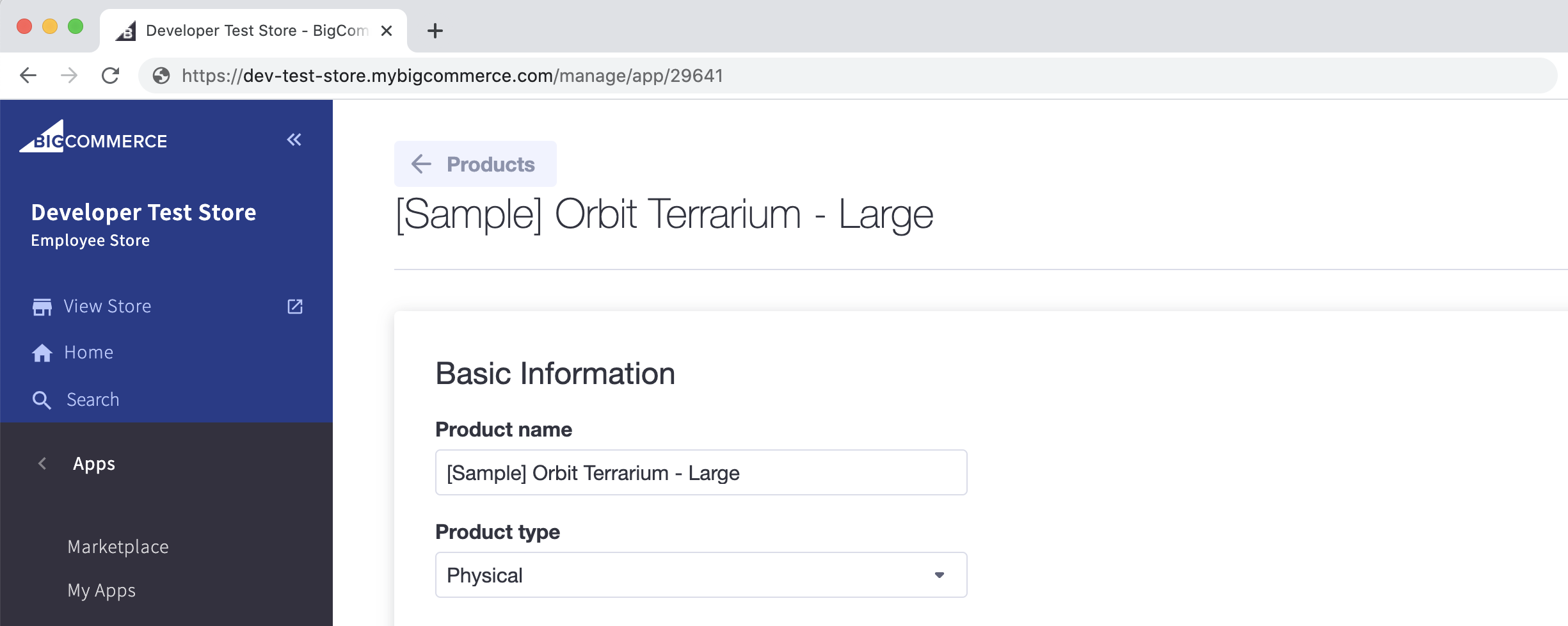
Individual product page view
This concludes our Next.js Sample App tutorial. To continue developing with BigCommerce, consider working through these supplemental materials: