

Widget UI Schema
When building custom widgets, the schema property allows the widget template developer to build custom user interfaces within the BigCommerce page builder platform. BigCommerce provides all the setting logic and design, the widget author just needs to tell us about the various settings that make up the widget. These settings make building custom widgets fast and easy! This is the exact mechanism we use for all the platform-provided widgets as well.
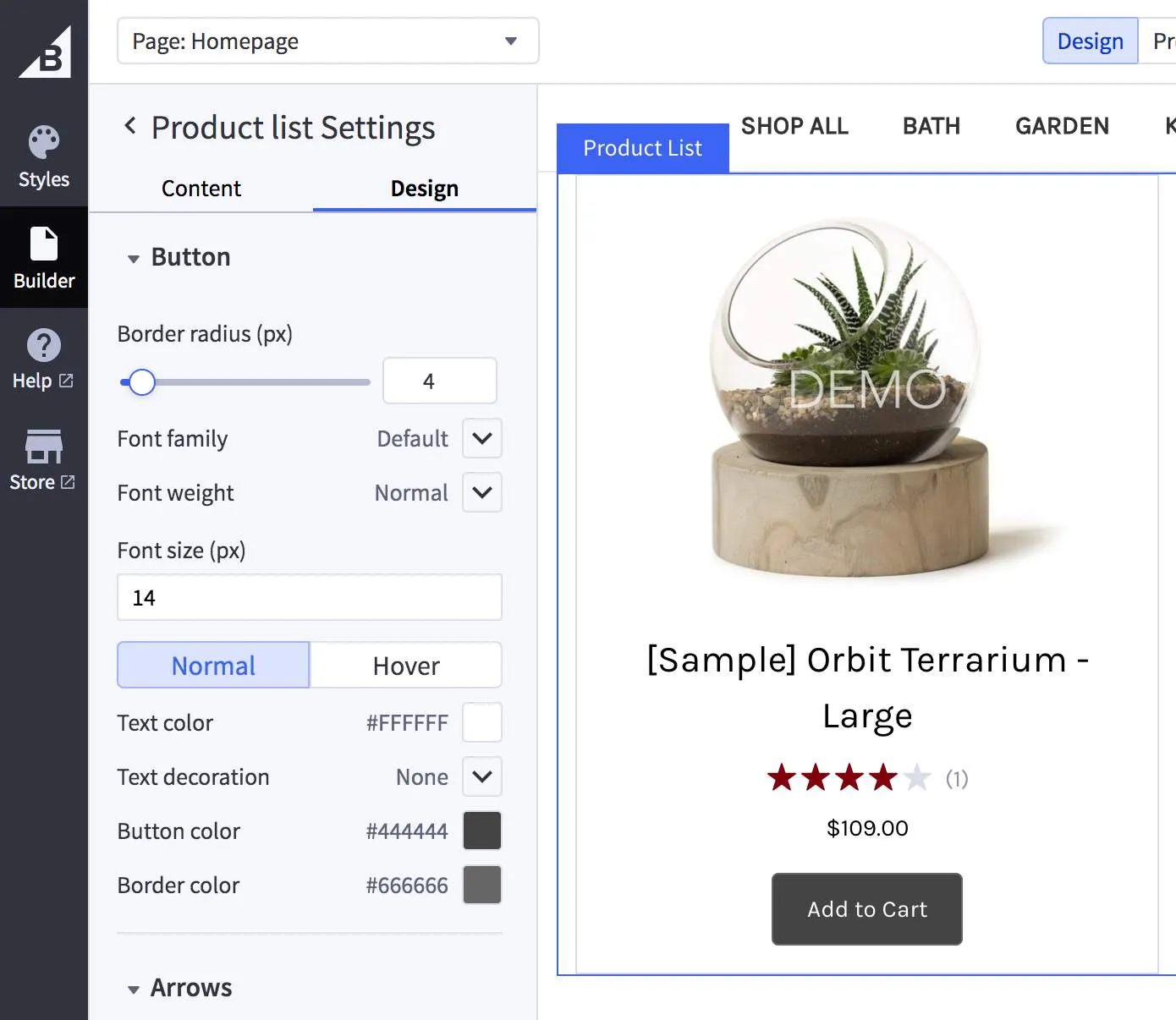
Tabs and Sections
Within the schema property of the Create a Widget Template endpoint, settings are grouped into tabs and sections.
Tabs
Tabs are a part of the Page Builder schema structure. The schema requires using a single root-level tab to contain all visible sections.
Sections render in the same order they are listed within a tab.

- When there is only a single tab, the tab interface will not be shown
- Tabs will display in the order they are provided.
- Tabs contain a list of sections which are rendered in the order in which they are provided.
Sections
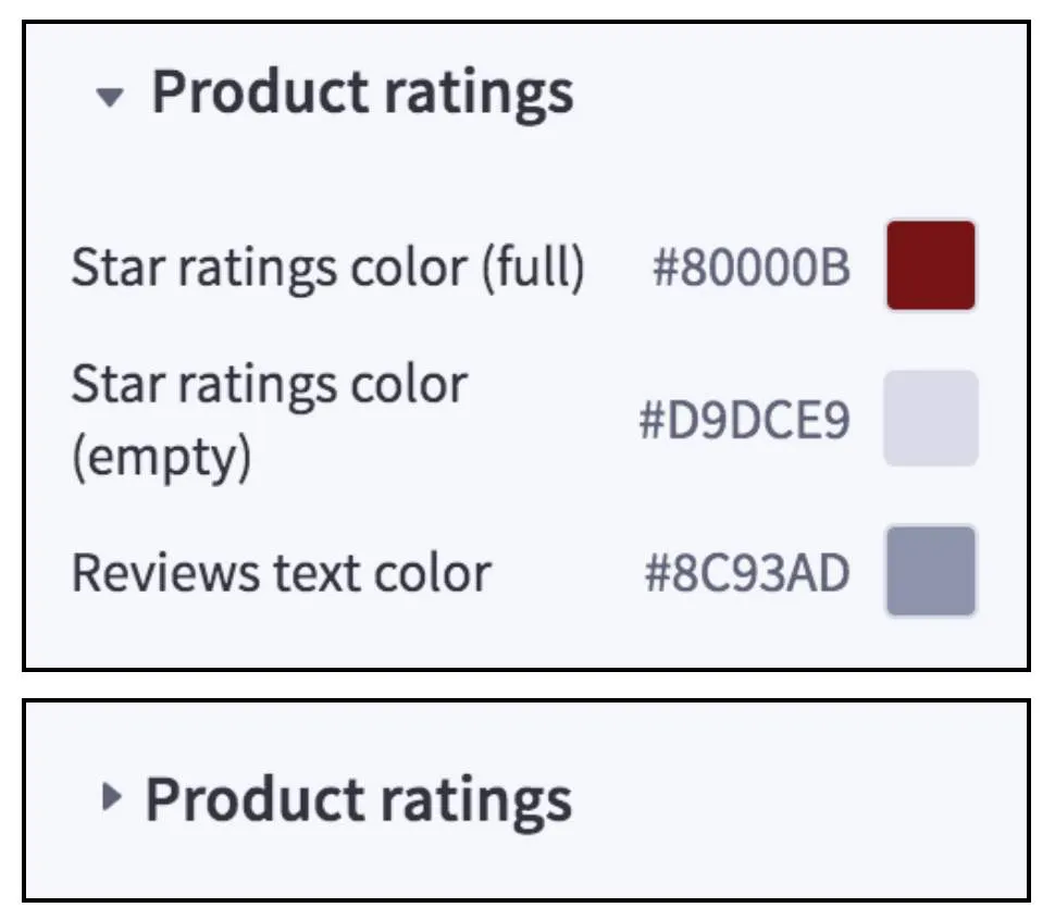
- Sections are groups of related settings.
- Each section will have a title that the user can collapse.
- Section labels are optional but are not collapsible without a label.
- Settings render in the same order they are listed within a section.
Array Type
Arrays allow for building collections of elements within the widget. Array elements live at the top level of the schema. Each element in the array can contain an entire schema.
Elements in the list have settings defined by the array’s schema, which you can build using tabs, sections, and settings.
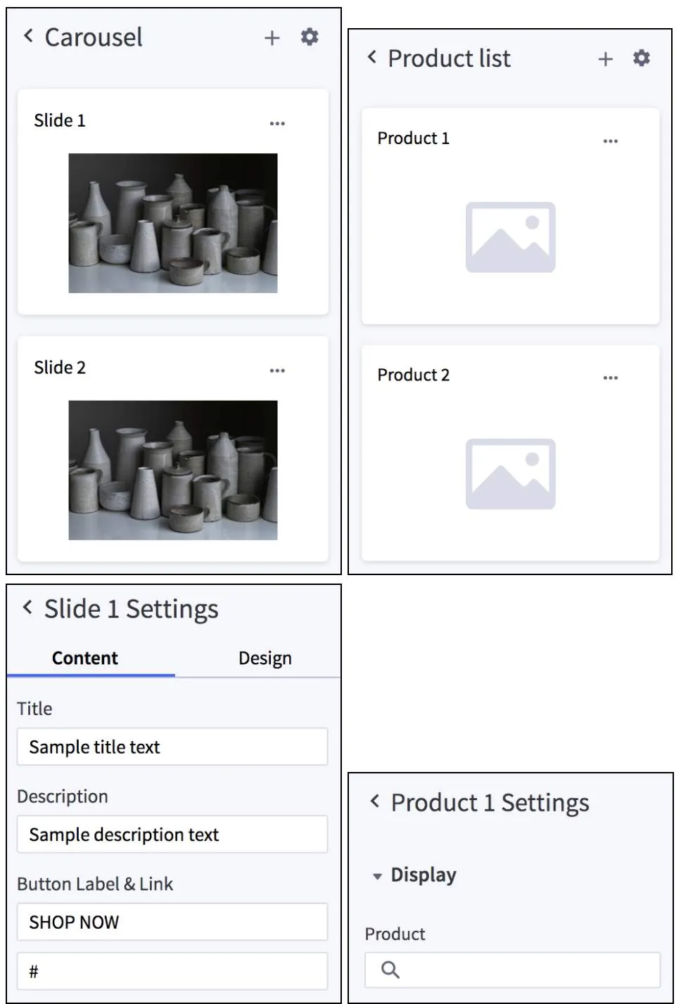
- Each element in the list can have tabs and sections included.
- The defaultCount attribute is the number of elements that are displayed in the list by default.
- Use the thumbnail attribute to display an image stored at the specified attribute name.
- Use the entryLabel attribute to set a name for each element in the list.
Hidden Settings
You can use hidden settings to set up controls that have no user interface drawn in Page Builder. Hidden settings live at the schema’s top level because they are not grouped into any other tabs or arrays. You can use them in advanced widgets with complex interactions in the preview pane, such as inline editing.
Schema Settings
Common fields between schema settings:
Below are examples of the different schema settings you can use in your custom widget template.
Alignment
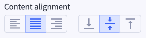
- It is possible to display “horizontal”, “vertical”, or “both” alignment controls depending on use case
- Possible values for horizontal are: “left”, “right”, “center”
- Possible values for vertical are: “top”, “bottom”, “middle”
Boolean

Box Model
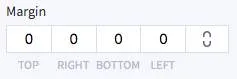
- Note that currently, values are in string format. this may change to number in the future. Stay tuned for updates.
- Clicking the lock will make sure all dimensions match the first value.
Code
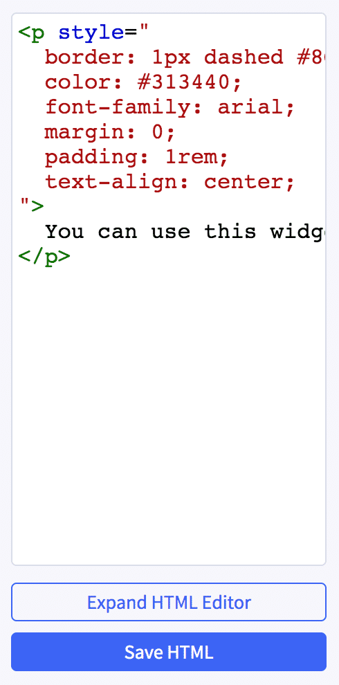
- In the future, we may add more options for the language (syntax highlighting). Currently only “HTML” is supported.
Color
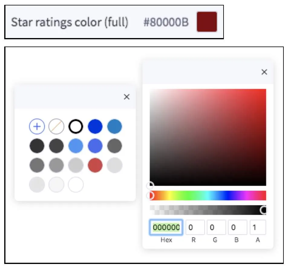
- Color picker supports RGBA
- Transparent can be selected, in which case the returned value is ‘transparent’.
Image Manager
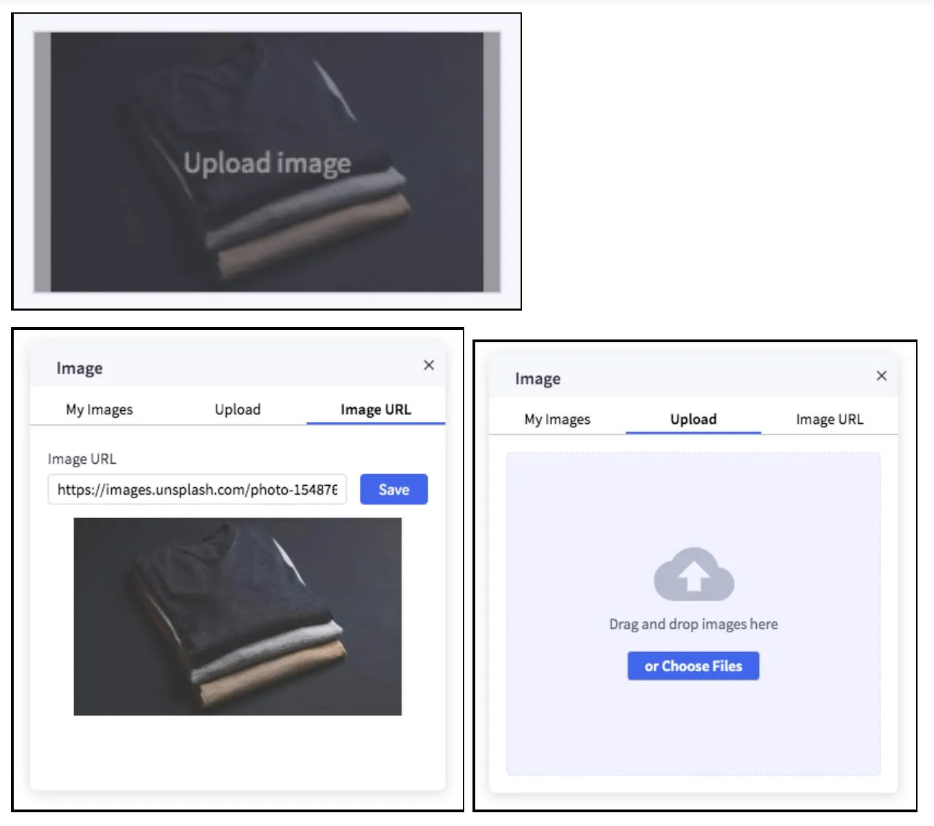
- Uploaded images go to the stores Image Manager
- “My Images” allows the user to select from previously uploaded images
Input
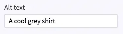
Number

- Response value will be a number, including information about the type (px, rem, etc)
- Two parse types are supported: “integer” and “float”
Product ID
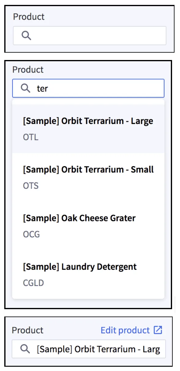
- Note that currently, id values are in string format. This may change to number in the future. Stay tuned for updates.
Product Image
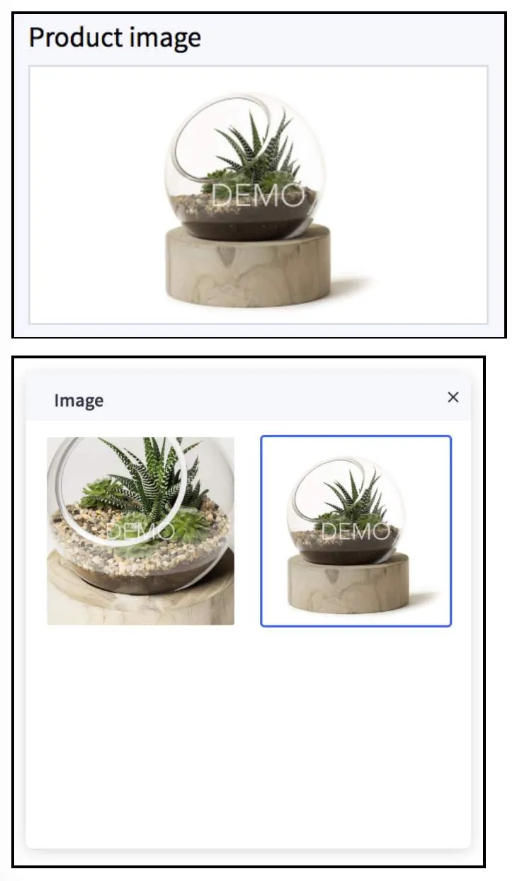
- Looks up product images based on the reference attribute
- Works nicely with productId setting type
Range
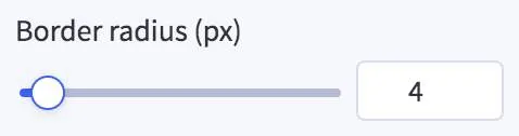
- The units are not currently returned. Expect some updates to return unit / value similar to number type. Stay tuned for updates.
Regex Input
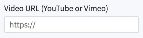
- Regex setting can capture and provide conditional state to other schema settings.
- In the example, we only want to show the autoplay video setting if the user has a URL which includes “youtube” or “youtu”
Select
Text
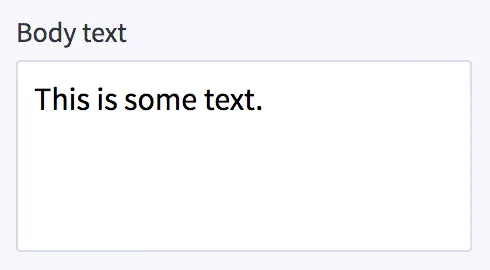
- New line characters are not supported. This is similar to “input” type, but displays more of the text and wraps lines.
Toggle

- This should be used purely to conditionally render settings based on the users selection.
- You can put other schema settings in each “condition” (color in this example)