Lab - Server Actions and Built-in Components
After the steps in the previous exercise, you should have a basic presentation of product FAQs displayed on your product detail page. Next, you’ll improve this with enhanced presentation using the core component library and interactivity.
In this lab, you will:
- Update the product FAQs presentation to use the Accordion component from the core component library
- Implement a “Load More” feature, using a server action to fetch additional pages of results
- Add loading states and error handling
Setup
This exercise continues where you left off previously in your Catalyst project. Simply start the dev server from the project root if it’s not currently running:
If you need a fresh start, you can follow the instructions below to set up a new project complete with previous exercise code.
- Install
degit.
- In your terminal, run the following, replacing the path to the working directory with your own path:
- Navigate to the new project working directory and initialize a Git repository for your project.
- Install the project dependencies.
- Copy
.env.exampleas.env.localand modify.env.localwith configuration details for your store. - Start the dev server process:
Exercise Reference Copy
If it’s helpful to compare your own code as you go, you can clone or download the completed version of this lab as a reference.
Product FAQs Enhancement Lab Snapshot
Step 1: Implement an Accordion
- Edit the file
components/custom/product-faqs/faqs-list.tsxand add an import among the other imports at the top of the file.
- Modify the original JSX code returned from the component as shown.
Browse to your FAQ-enabled product on your storefront, and you should now see the original presentation replaced with a cleaner, compact interface allowing FAQs to be expanded individually.

As a brief exercise to demonstrate how common components can be themed using CSS variables, let’s also override one of the Accordion component’s color styles.
- Modify the
Accordionplacement with astyleproperty to set--accordion-light-title-text-hoverin this context.
In this case, we’re making use of one of the primitive color values defined in the site-wide palette (info), utilizing the matching CSS variable (--info). Since Makeswift is integrated in this project, this CSS variable is defined in lib/makeswift/components/site-theme/base-colors.tsx. Browse to the product page again and verify that the corresponding color value is used when hovering over each accordion title.
In a Makeswift-enabled storefront, it’s considered best practice to avoid the direct use of primitive color values as we’ve done here with --info. Instead, the color palette defined within the Makeswift site should be authoritative, with the use of Site Theme properties to allow for mapping them to practical CSS variables for components.
See Makeswift Core for more on this technique.
Step 2: Implement a Load More Component
Time to implement the ability to load more product FAQs.
- Edit the file
messages/en.jsonto add one more string in the “FAQ” section: A “Load More” label.
- Open the file
components/custom/product-faqs/load-more-faqs.tsx. This component handles the interactivity involved with the “Load More” action and renders any additional “pages” of FAQs that are loaded.
Note the use client directive at the top of the component file. As it’s responsible for interactivity in the browser, this is a client component.
- Add an import for the
Buttoncomponent from the core library, with the other imports at the top of the file.
- Modify the props interface and destructuring expression to accept the appropriate props.
- Modify the component to create state values to track the “more FAQs” that are loaded by the component, as well as the current end cursor. This modification will also create a full list of FAQs to display by concatenating the original passed FAQs with any further FAQs that are loaded, as well as defining a function for loading the next set based on locale.
- Modify the returned JSX to render any additional loaded FAQs, using the same
FaqsListcomponent already designed for this.
- Modify the returned JSX code to include a “Load More” button if there is an
endCursorvalue.
- Open the file
components/custom/product-faqs/index.tsxand add the boolean propshowLoadMore. This isn’t currently needed but will allow for conditional inclusion of the “Load More” interactivity in the future.
- Add the
LoadMoreFaqscomponent, with the rendering conditional onshowLoadMoreand the presence of anendCursor.
Browse to your product page once again. Presuming the product contains more FAQ metafields than the two initially loaded on the page, you should have a “Load More” button. Since the server action this will call is already wired up, you can see a corresponding request in the Network tab of your browser’s dev tools when you activate the button, although there won’t be any result until the server action is working.
Step 3: Complete the Server Action
- Open the file
components/custom/product-faqs/_actions/get-next-product-faqs.ts. This defines the server action that the “Load More” interaction in the client component activates. - Modify the component to run the metafields query.
You can see that not much is required here, as this function is essentially serving simply as a “pass-through” to the query function. Having the wrapper here allows this specific context to be defined as a server action, as well as any future logic that is specific to this response to our “load more” button.
Browse to your product page once again. Presuming the product contains more FAQ metafields than the two initially loaded on the page, you should have a working “Load More” button that will successfully fetch and display the next (up to) two FAQs.
Step 4: Load Initial FAQs Asynchronously
In the next step, we’ll use the <Stream> component pattern to ensure the initial loading of FAQs doesn’t impact the rendering of the basic page content.
- Edit the file
components/custom/product-faqs/index.tsxand fill out a definition for theProductFaqsSkeletoncomponent. This defines a visual loading state appropriate for the FAQs content.
- Add an import at the top of the file for the appropriate streaming resources.
- Update the props interface to accept a “streamable” version of the
faqsCollection, which can be resolved as a promise or not, as well as establishing an alias for the prop in the component signature.
- Modify the current content of
ProductFaqsto wrap it in<Stream>with an appropriate fallback, as well as a callback that will render when the streamable value is resolved.
- Edit the file
app/[locale]/(default)/product/[slug]/page.tsxto wrap the FAQs fetch inStreamable.from, ensuring we have a promise that doesn’t block page rendering and will only be executed when it is used.
- Update the
faqsCollectionprop ofProductFaqsto receive the streamable value.
- Edit the file
components/custom/product-faqs/_data/component-data.ts. To make the new loading state obvious, you’ll artificially extend the time it takes to perform the query. Add the following at the top of thegetProductFaqMetafieldsfunction.
Browse to or fully refresh your product page to see the loading state in action.
Step 5: Additional Loading State
The “Load More” button works, but currently the user receives no feedback while the network request is occurring to let them know that something is happening. Let’s improve that.
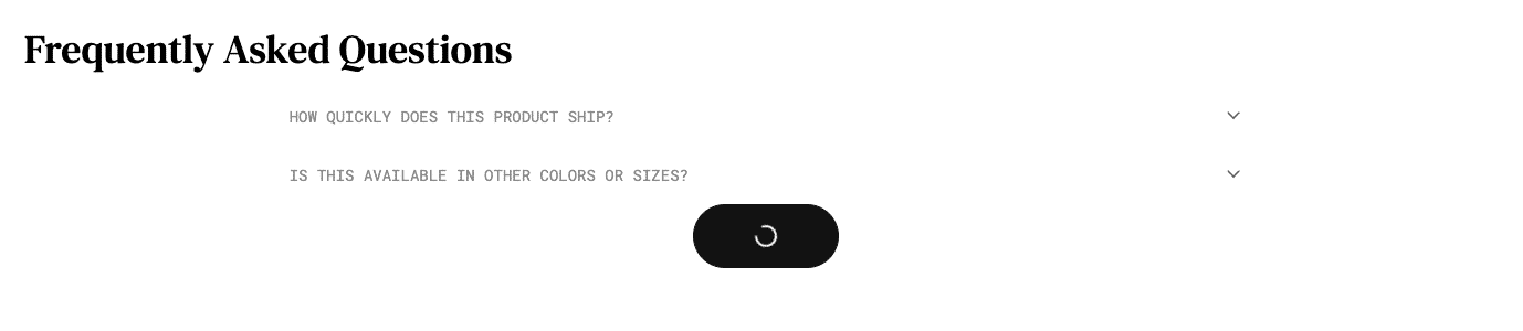
The Button component you’ve already implemented supports a built-in loading state. All that’s needed is to pass it a state variable that tracks when the button is in the loading state.
- Open
components/custom/product-faqs/load-more-faqs.tsxand add apendingstate var and pass it on toButton.
Browse to your product page again and use the “Load More” button to observe the new loading state.
Step 6: Add Error Handling
Let’s add a proper user notification in the event that our “load more” button results in an error.
- Edit the file
components/custom/product-faqs/load-more-faqs.tsxand add the following import after the other imports.
- Modify the
catchblock ingetNextFaqsto trigger an error notification.
- If you want to test this error notification, temporarily modify
components/custom/product-faqs/_actions/get-next-product-faqs.tsand add an exception.
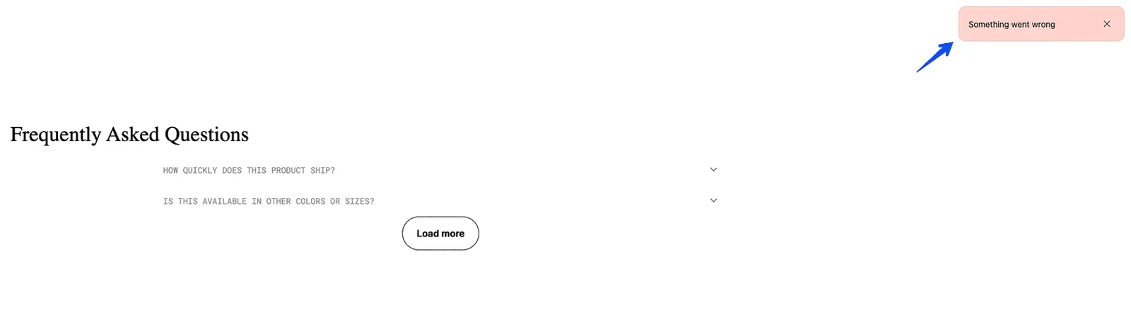
Now when you use the “Load More” button, you should be able to observe the simple error notification in the top right corner of the viewport.