

Lab - Test Custom Theme Settings
In this lab, you will:
- Open Theme Styles in the control panel
- Verify the custom variation and settings from the config.json lab
- Confirm your custom font appears in the font list
- Confirm the Customer Group Banner fields appear and apply
- Preview and save your changes
Prerequisites
- Previous labs have been completed
- Your customized theme has been bundled and uploaded to the store
Throughout the customization labs, you added settings to config.json and schema.json that surface in Theme Styles in the control panel. Now that your theme is uploaded to the store, you can open Theme Styles and confirm that each customization appears and behaves as expected.
Step 1: Open Theme Styles
There are two paths for reaching Theme Styles in the control panel:
- From Page Builder — open Page Builder for your storefront and select the Theme Styles panel to edit the colors, fonts, and other settings your theme exposes.
- From the channel (Makeswift-enabled storefronts) — open the channel’s entry in the control panel and click the dedicated Theme Styles button, shown alongside Edit in Makeswift.
To open Theme Styles through Page Builder:
- Log in to your store’s control panel
- Navigate to Storefront > Themes
- Locate your uploaded theme and click Customize to open Page Builder
- Select the Theme Styles panel
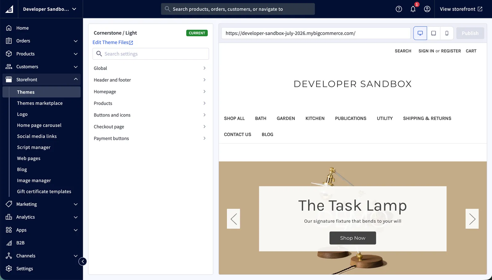
Makeswift on Stencil is currently in Beta; features and availability are subject to change. To reach the same Theme Styles from Makeswift, return to the dashboard and select the Edit Theme Styles button directly next to the Edit in Makeswift option.
Any setting you declared in schema.json appears in Theme Styles. If a setting is missing, confirm it has a matching key in config.json — a schema.json entry without an id-matched config.json key will not appear.
Step 2: Verify Variations and config.json Settings
- Confirm the new variation you created in the config.json lab appears at the top of Theme Styles
- Select the variation and verify the footer background color reflects your
footer-backgroundColorvalue (#66ccff) - Verify the carousel arrow color and background color match the values you set
- Verify the homepage new products count from the layout lab reflects your configured value
Step 3: Verify the Custom Font
- Open the typography or fonts section of Theme Styles
- Locate the Heading font setting
- Confirm your custom font (for example, Gotham) appears as an option in the font list
- Select the custom font and preview the change on the storefront
The custom font appears in the font list because you added it to the headings-font options in schema.json. If it is missing, revisit the schema changes from the custom font lab.
Step 4: Verify the Customer Group Banner Fields
- Open the Header section of Theme Styles
- Confirm the Customer Group Banner section appears with the following fields:
- Customer Group Banner Message (text)
- Customer Group ID (text)
- Customer Group Banner Text color (color)
- Customer Group Banner Background Color (color)
- Enter a banner message and the ID of a customer group
- Choose a text color and background color
- Preview the storefront as a customer in that group to confirm the banner renders with your settings
Step 5: Preview and Save
- Review your changes in the Theme Styles preview
- Save the changes to apply them to the storefront
Open only one instance of Theme Styles against a storefront at a time. There is no synchronization mechanism to reconcile changes made by multiple instances, so changes saved in one instance may be lost.