

Lab - Building Blocks
Introduction
You’ve previously scaffolded a new Overview page in the Buyer Portal. In this exercise, we’ll start to flesh out the contents of this page with the components provided by Material UI and the Buyer Portal core.
In this lab, you will:
- Use available Material UI and Buyer Portal components to build layout
- Learn how to create reusable styled components
Setup
This exercise continues where you left off previously. Make sure the dev server is started in your Buyer Portal project:
If you need a fresh start, you can follow the instructions below to set up a new project complete with previous exercise code.
- Copy the project with the appropriate tag.
- Install dependencies.
- Run the dev server.
Remember!
Script Manager in your store control panel must contain appropriate header/footer scripts to load the Buyer Portal from your local environment on the appropriate port.
Revisit the initial setup lab for full details on setting up your environment.
Exercise Reference Copy
If it’s helpful to compare your own code as you go, you can clone or download the completed version of this labs as a reference.
The Overview Page Structure
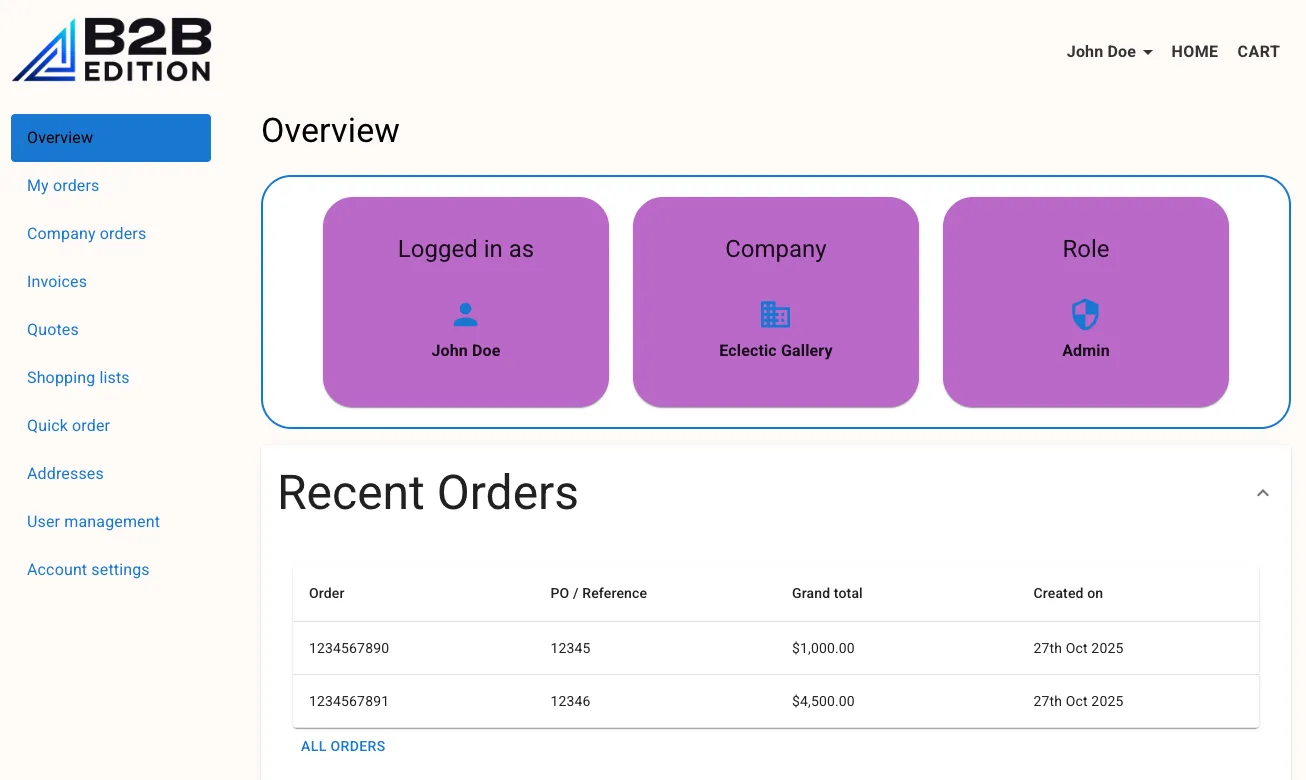
By the end of this exercise, the Overview page will be fleshed out to include:
- An “Identity” section: This section will render information about the user, populated by their session state, using flexible
Cardcomponents. - A “Recent Orders” table: For now, this table will be populated by mock order data. The table will be rendered in a collapsible accordion.
Step 1: Add the Identity component
Remember, all file paths referenced in these exercises are relative to apps/storefront/src in your Buyer Portal project.
Boilerplate for the Identity component already exists in pages/Overview/components/Identity.tsx. Already present in this component is logic that retrieves the user’s information from the session:
We’re not focused on the use of useAppSelector in this exercise, but this will make more sense when we discuss Redux.
- Open
pages/Overview/index.tsx. - Add an import of
Identityand replace the current placeholder text with the component.
- Open
pages/Overview/components/Identity.tsxand return JSX with aBoxcomponent.
You should see your “TODO” text rendered on the page.
Material UI Basics
For our starter content, we’re wrapping the page in a Box component from Material UI. This is one of the most generic layout components. It is rendered as a div by default, but the HTML element can be changed with the component prop.
The sx prop demonstrates a core Material UI pattern for styling single instances of components:
- The prop accepts an object with camel-cased CSS properties.
- The
paddingXandpaddingYvalues demonstrate the support properties provide for responsive values. Our configuration provides certain padding values for extra small (xs) screens but overrides them with different values for large (lg) screens and above. sxis “theme-aware”, meaning that many properties accept strings referring to named values in the Material UI theme. The “primary.main” string refers to a value in the “palette” theme config. See the documentation for the available schema.
In addition to the sx pattern, Box supports all MUI System props.
Adding Grid and Card
- Replace the “TODO” text with JSX as shown.
We’re using two additional Material UI components here:
Gridfacilitates simple responsive grid layouts.- A parent
Grid(with thecontainerprop) contains multipleGriditems (with theitemprop). - Each grid item specifies its width in a 12-column layout. Our
xsvalue of 12 means each item spans the full width of the container by default, while thelgvalue overrides this with 4 (meaning three items per row) for larger screens.
- A parent
Cardis a simple content container. Note that it contains aCardHeaderandCardContent.
The Overview page should now render a basic display of the user’s identity details.

Try resizing your browser window to observe the responsive behavior.
Step 2: Enhance the Presentation
In this step, we’ll restyle the cards used to present the identity information. While we could use the sx prop for each card, we want to avoid unnecessary duplication and centralize our styles for consistency.
- Open
pages/Overview/components/Identity.tsxand add a definition forIdentityCardas shown.
- Replace
CardwithIdentityCard.
styled Components
The use of the styled utility follows a standard pattern used by popular libraries like Emotion and Styled Components. It decorates an existing component with additional styling, resulting in a new component that retains the features of the base component while applying the new styles.
Like the sx prop, the Material UI styled utility is theme-aware. Note that as demonstrated in our IdentityCard component, a callback wrapper takes a parameter including theme, allowing theme values to be accessed with object syntax.
Note that the Buyer Portal core also uses the styled utility from the @emotion/styled package when values from the Material UI theme aren’t necessary. Pay attention to where styled is imported from.
Icons and Typography
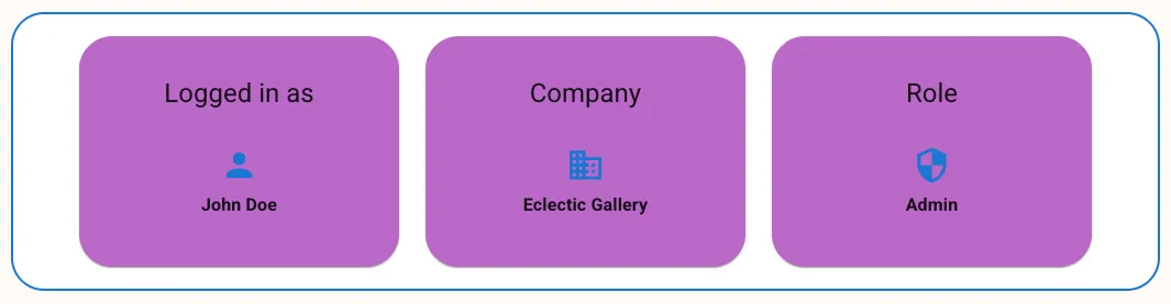
We’ll also apply two other enhancements: the use of icons and standard typography.
- Replace the existing content of each card as shown.
- The components
PersonIcon,BusinessIconandSecurityIconrender SVG icons from the Material Icons library (via@mui/icons-material). - The
Typographycomponent is theme-aware, meaning the text will respect thetypographyschema of the Material UI theme, based on the specified props.
Your “identity” section should now reflect the enhanced styles and icons you’ve applied.
Step 3: Add Recent Orders
Now we’ll turn our attention to the page’s “Recent Orders” content. As with the previous steps, we’re starting with a boilerplate RecentOrders component that is already defined.
- Open
pages/Overview/index.tsxto add the appropriate import and render the component.
- Now that we’re no longer using
Button,HeadlessRoutes, anduseNavigatedirectly in this component, remove them. Also remove theconst navigate = useNavigate();line from the component body.
Removing this unused code is important to avoid build errors later on!
- Open
pages/Overview/components/RecentOrders.tsx. Add the returned JSX as shown.
The notable new components we’re using are provided by the Buyer Portal core:
B3Spindisplays a spinner until content is ready to be displayed. For now,isSpinningis set tofalse, but later we’ll wire it to React state.B3Tableprovides sophisticated rendering for lists of records.- Note the
onClickRowcallback, which accepts one of the rendered items. We’re usingnavigatehere with a manual path based onitem.orderId, since no constant exists for an individual order’s detail page. listItemsshould be an array of the items to be rendered.ordersis a React state value not yet being populated.columnItemsshould be an object defining the table’s columns. We haven’t yet definedorderColumns.
- Note the
Our code also includes a custom OverviewCard component, which is another simple example of styled.
- Add the logic shown before the returned JSX.
We’ve put a simple React side effect in place, which will execute once when the component mounts. We’re not yet worrying about fetching real order data, instead setting the orders state value with an array of mock orders.
You can inspect mockOrders in the same file to see the format of the order records. This matches the schema the real data will eventually have:
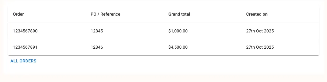
The orderColumns array defines each column we want to display, with a key matching one of the properties in the record data. By default, each row will render the value of the specified field as simple text. For two of these columns, we’ve provided a render callback that formats the rendered value uniquely.
You should now have the “Recent Orders” table rendered on the page with mock data.
Step 4: Add an Accordion
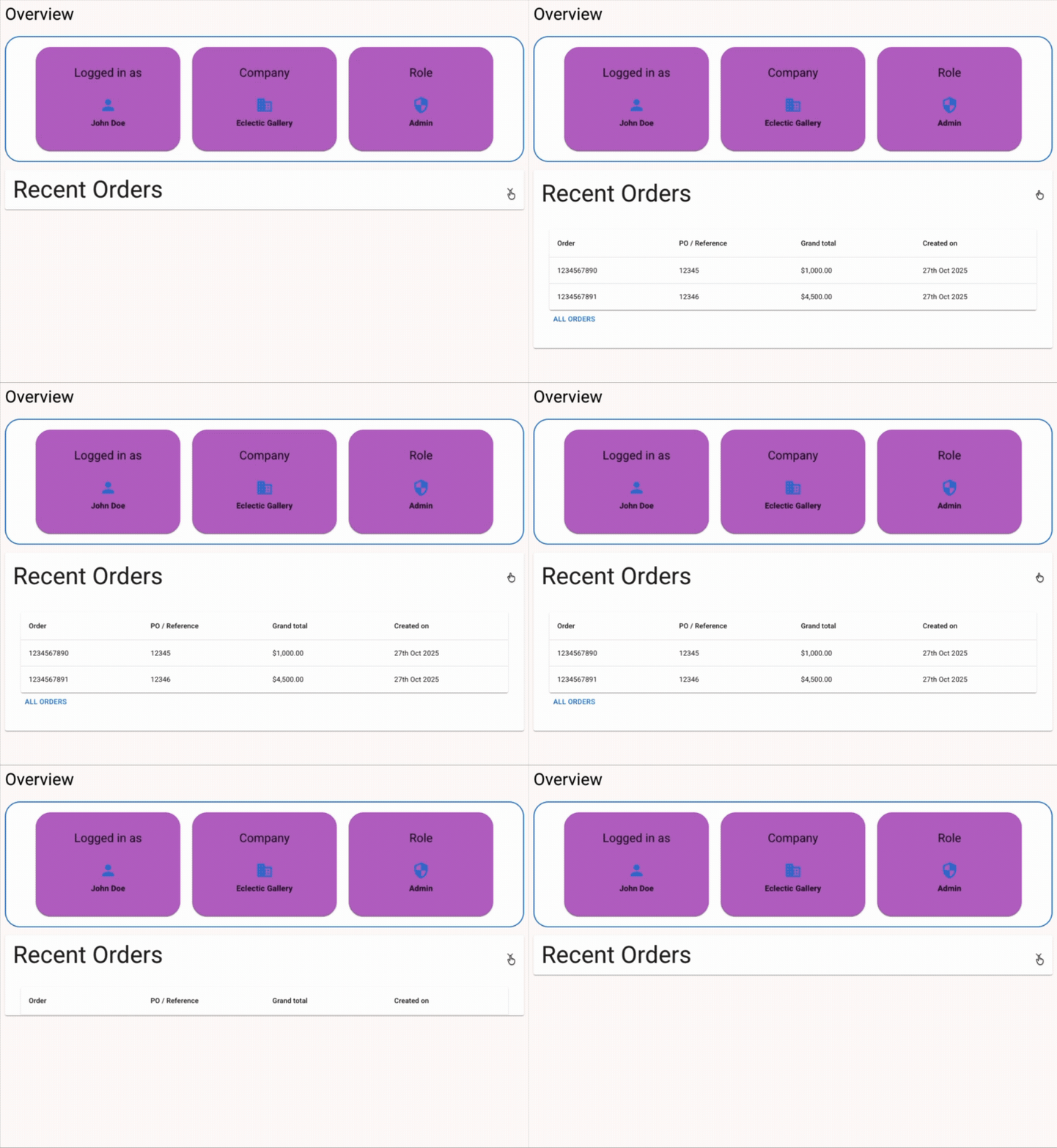
For our last step, we will wrap the “Recent Orders” table in an accordion component, collapsed by default. We will eventually be adding other data types to this page, so we’ll allow users to expand the sections they want to view.
- Open
pages/Overview/index.tsxand add the wrappingAccordion.
Accordion is our new component here. Its children, AccordionSummary and AccordionDetails, are fairly self-explanatory.
Now that the orders table isn’t displayed initially, we can also defer fetching its data until the accordion is expanded. Once we’re loading data with real GraphQL requests, this will save us from unnecessary queries.
- Add a state value to track whether the accordion is open.
We’re using a change handler on Accordion to set the ordersOpen state value, and we’re passing this to a new startLoad prop on RecentOrders to let that component know the status.
- Open
pages/Overview/components/RecentOrders.tsxand add the new prop.
- Update
useEffectto depend on this state value, and to avoid loading data ifstartLoadisfalse.
Navigate to your Overview page and verify that the “Recent Orders” table is rendered in a working accordion.
Full Exercise Code
Taking It Further
- Explore the Material UI components documentation and experiment with incorporating other components into the Overview page.
- Create a
styledversion ofAccordionand apply your own styles. Explore with responsive values and the use of theme values.