

Theming in Catalyst
Introduction
The default Catalyst theme is built on a design system of modern React components for use in composable websites, built and maintained by BigCommerce.
This component system is designed specifically for ecommerce, providing beautiful, out-of-the-box UI for every part of the commerce experience. The library includes general, low-level components like buttons and accordions, as well as orchestrating these lower level components into more sophisticated presentations like product cards, product lists, and a site header.
The design patterns implemented by Catalyst components already support a high degree of flexibility for theming without modifying component code. With Makeswift integrated, this flexibility is taken even further, with editor properties that map directly to the general components used in the Catalyst theme. This gives marketers and editors the ability to manage the look and feel of the entire storefront, not just content added in the editor.
The Site Theme Element
In the Makeswift editor interface, the Site Theme element found in the Elements panel controls global style settings for the storefront theme.
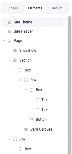
The properties of this element are grouped by various common components used throughout the storefront and include various font, size, and color values.
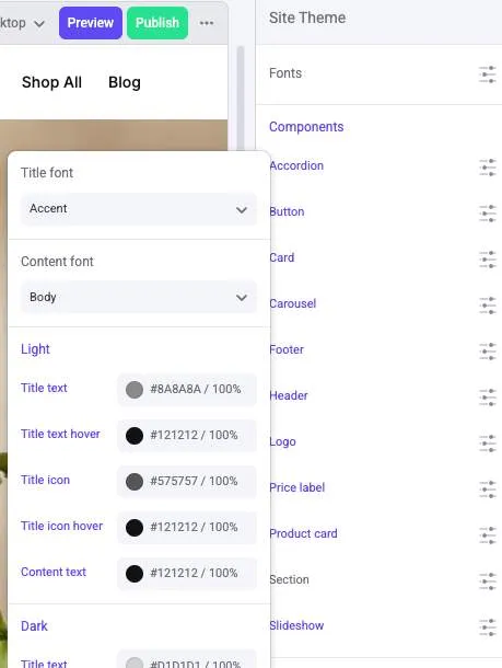
- The Fonts list at the top of the properties panel has a specialized role, allowing you to set Heading, Body, and Accent font families that can then be applied to the various other font properties within the other groups.
- Note the properties groups (like Accordion and Button) correspond to the basic building block components in the Catalyst theme, usually located in primitives.
- As with any component, the color palette defined in the Design panel determines the available values for all color properties.
Try It Out
In the Makeswift builder, select the Site Theme element and edit the Light > Title color for the “Product card” component.
In the location bar of the builder, manually enter the URL path of a valid category page, then use “Preview” to view the page with your new title style applied to the product cards.
Like with any component property changes, “Publish” must be used to publish Site Theme’s new properties before the change takes effect on the public storefront.
In Stencil
In Stencil storefronts, a similar “Component Styles” element appears in the Elements panel. It allows global configuration of Stencil’s own unique set of components, rather than the Catalyst theme components described above.
Under the Hood
Site Theme is a component registered with Makeswift controls, using the same patterns we’ve already seen. This particular component’s controls simply have a more complex schema than most, one which is split up among multiple files.
lib/makeswift/components/site-theme contains the component’s implementation. Within this location are the following important files/directories:
- components: Each file in this directory defines schema for a particular group of properties, typically in the form of a Group control.
- components/index.ts: All files in the components directory are imported here and exported within a single object.
- register.ts: This file aggregates the various font and component properties into the final theme component registration.
- index.tsx and client.tsx: The final rendering of the SiteTheme component is handled in these files.
Another file important for the implementation of SiteTheme:
- lib/makeswift/controls/font-tokens.ts: The standard font family types (Heading, Body, Accent) are defined here. The file takes care of both the properties for defining these font types (with typical Font controls), as well as the FontFamily function that makes these types available in a Select control for various properties in the component groups.
If SiteTheme is a registered Makeswift component, why doesn’t it need to be dragged to the canvas in the builder?
SiteTheme is an example of a built-in element placed in code. We’ll explore this in more detail later.
From Properties to CSS Vars
The actual rendered output of SiteTheme isn’t visual content, but rather a <style> element that sets a number of CSS variables on :root. This output is included on all storefront pages via its inclusion in app/layout.tsx.
These styles complement a common pattern in core components: the use of specifically named CSS variables to override the look and feel of a particular component.
The list of CSS variables supported by a component is documented at the top of the component file. For example, —accordion-title-font-family is utilized by the Accordion component:
If —accordion-title-font-family is set, it will be used instead of the more generic —font-family-mono.
The groups and prop names of SiteTheme are designed to map to these component-specific CSS variables. The value of each of its properties is output as a variable usually following the following naming convention, separated by hyphens:
- The key of the property group as exported in lib/makeswift/components/site-theme/components/index.ts
- The prop names of any nested Group controls
- The prop name of the individual property
Any keys or names in camel case are converted to kebab case (so that titleText becomes title-text).
A Full Example
Let’s explore how a SiteTheme property maps to a Catalyst default component, starting with the component itself.
- ProductCard is defined in the default Catalyst theme directory, in primitives/product-card/index.tsx.
- ProductCard supports the CSS variable —product-card-light-title, which is used for the card title when the “light” color scheme is applied.
- In lib/makeswift/components/site-theme/components, we find productCard being exported in index.ts, with the definition in product-card.ts.
- The control Group in product-card.ts includes the light prop, which is a nested Group of its own.
- Within the light group, a title prop is declared as a Color control.
From this schema, we get a corresponding property that can be set to one of the site’s standard colors in the editor interface.
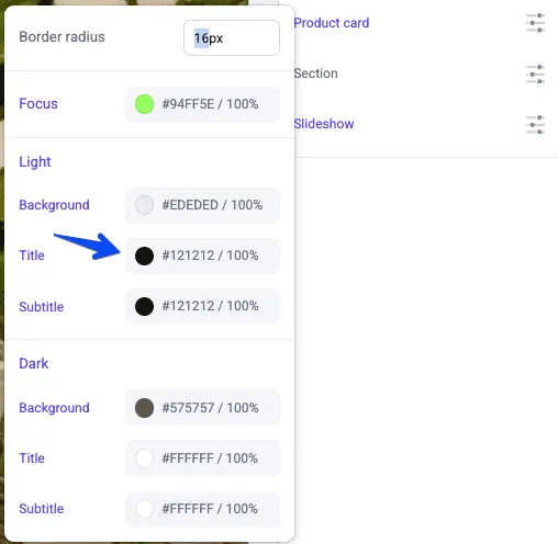
From the pattern {group key}-{nested group prop}-{prop}, we can see that the selected value will be rendered with the CSS variable name —product-card-light-title. With this variable being set globally, the title of ProductCard will be affected wherever it is used.
Try Out a New Property
Try adding a new style property of your own in the “Product Card” group.
- Open the file lib/makeswift/components/site-theme/components/product-card.ts and add the titleSize prop to the props object.
Since you’ve added this within an existing group, this is all that’s required in order for your new property to show up in the “Site Theme” element properties in the Makeswift builder.
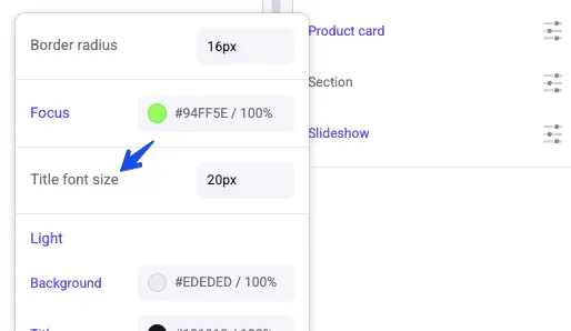
Given the existing group name and the transformation of our titleSize prop name to kebab casing, we can expect this value to be output for the CSS variable —product-card-title-size.
- In the root directory of your Catalyst theme components, edit the file primitives/product-card/index.tsx and add a style prop to the <span> where {title} is rendered.
- In the location bar of the Makeswift builder, enter the URL path of a valid category page.
- Select the “Site Theme” element in the Elements panel and try editing the new “Title font size” property. Observe the effects on the cards in the product list.
Keep in mind that while the default Site Theme properties are grouped by component type, they are simply groups of properties, and the CSS variables they set can be used wherever is appropriate in your own frontend code. While a component-based approach is encouraged to keep the effects of these properties on the theme predictable, you can group and use your properties in whatever way make sense for your UI structure.
Keep these other steps in mind for creating your own Site Theme property groups, or if you want to expand the font options:
- If you want to introduce another basic font type, edit lib/makeswift/controls/font-tokens.ts. Make sure to include the Font control for your new type in fontFamilyTokens as well as including the new type in the options returned by FontFamily.
- Create a file for your own properties group in lib/makeswift/components/site-theme/components, exporting a Group control with the desired property controls.
- Add your new properties group in /lib/makeswift/components/site-theme/components/index.ts.