

Lab - Add a Subcategory Listing in Catalyst
This lab focuses on enhancing your storefront’s category pages with a dynamic subcategory listing. You will learn to efficiently fetch and display data using GraphQL fragments and reusable React components. You will also explore styling and customization by creating and applying new Tailwind CSS variables, giving you full control over the look and feel of your new feature.
In this lab, you will:
- Add a subcategory listing feature to your storefront’s category pages
- Practice the use of GraphQL fragments and React components
- Create new Tailwind CSS variables and utilize them in your presentation
Prerequisites
- Node.js 24 or later
- A Catalyst project set up locally, as completed in the previous exercise
- Category and product data as described below
Catalog Data Prerequisites
You’ll be implementing the same essential feature as the subcategory listing you added in Stencil, so you’ll need the same catalog data structure. As a reminder, this includes:
- At least one category accessible from the main menu and containing at least three enabled subcategories
- Enabled products assigned to all subcategories mentioned above
Remember that your Catalyst storefront is separate from your Stencil storefront, with its own category tree, so you’ll need to take the same steps to configure categories appropriately. Also, note that any products originally assigned only to your Stencil storefront channel are not automatically assigned to your Catalyst channel, so either add your original products to the Catalyst channel or assign your Catalyst sample products to the new categories.
See the “Add a Subcategory Listing in Stencil” lab for more details on setting up your catalog data.
Setup
If your dev server is not currently running, start it by running the following command in the project’s root directory:
The Subcategory Listing
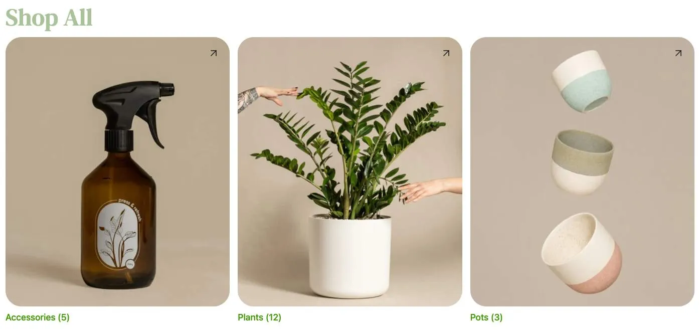
In the Catalyst implementation of the subcategory listing, you’ll take advantage of existing Soul components and existing style variables to keep a consistent look and feel with the rest of the theme. In addition, you’ll have full control over the GraphQL query used to load the subcategory data, so this version will include images.
Step 1: Add the Subcategory List Logic
In this section, you’ll implement the appropriate GraphQL to load a category’s subcategories.
- Create the file components/subcategory-list/component-data.ts and add the following content.
This defines a GraphQL query for site.categoryTree, selecting the immediate children of the root category identified by $categoryId, then utilizes the API client to make this request in getSubcategories.
This API client request follows the typical Catalyst pattern, including passing in a logged-in customer’s unique token.
- Open the main category route file, app/[locale]/(default)/(faceted)/category/[slug]/page.tsx.
- Add an import for your query function near the top of the file.
- Locate the Category component definition and add a call to your getSubcategories function immediately before the component’s returned JSX.
- Add a placeholder for the alternate content to output if subcategories are found, before the default returned JSX.
This expression will render the placeholder instead of the usual category page content if the list of children of the top item in the subcategory tree contains any items.
- Browse to a category with subcategories and verify that your placeholder is displayed instead of a product list.
Step 2: Add the Subcategory List Component
- Create the file components/subcategory-list/index.tsx and add the following initial content.
This defines some initial imports and a React component that accepts props including a title and a subcategories array. All React components in Catalyst utilize TypeScript for predictability and type safety. Notice that the return type of the getSubcategories function you previously created is used to inform TypeScript what the subcategories prop data should look like.
getSubcategories is an asynchronous function that initially returns a Promise. The type expression above uses Awaited to specify the data ultimately returned from that Promise.
- Fill in the return statement with JSX to display the category name and loop through the subcategories.
Compared with the mark-up included in the Stencil component template, this is more verbose. However, this is primarily due to the inclusion of Tailwind CSS utility classes directly in the mark-up. No separate CSS will be necessary to provide the styling of your component.
The design principles of Tailwind CSS keep styling closely coupled with components, providing the ability to modify components with greater confidence of avoiding unintentional side effects in other areas of the theme. Using this model, efficient styling often involves smart use of reusable components, as well as style variables used throughout the theme. The heading in your JSX includes an example of a reference to a value in the theme’s common color palette (“contrast-400”) with the class text-contrast-400.
The component code currently loops through the subcategories but renders nothing for each. Let’s fill this section out next.
- Add JSX for each subcategory within the loop.
This addition takes advantage of the built-in Card component from the Soul library, allowing this implementation to do the UI heavy lifting. All that’s needed is providing a link target, image information, and title for the card.
Now that your subcategory component is fully fleshed out, it’s time to replace your initial placeholder with it.
- Open the file app/[locale]/(default)/(faceted)/category/[slug]/page.tsx and add an import for your component near the top of the file.
- Locate the section of the page component where you previously included the subcategory list placeholder text, and replace this with your component.
- Browse to the category page again and verify that the full content of the subcategory listing is displayed.
Step 3: Create Style Variables
In this final step, you’ll practice creating configurable variables to control aspects of the styling for your custom component.
New color variables for a scenario like this are probably inadvisable in a real-world application. Catalyst comes with an extensive pre-defined palette of color variables, from primary to accent to contrast colors, designed to keep the color scheme cohesive throughout the theme. For any given component, you should first consider whether values from the existing palette are appropriate. The variables you’ll create here are simply a convenient example of customizable CSS and Tailwind config.
In this case, you’ve deferred most of the structure of your component to the built-in Card, so your theming options are limited to what this component exposes. While you could implement your own UI instead, in order to create more customizable theme values, Card does include some styling controlled by CSS variables:
- —card-light-text controls the default color of the card titles.
- —card-border-radius controls the rounded corners of the cards.
You’ll start by defining values for these CSS variables on a wrapping element directly in your component.
- Open the file components/subcategory-list/index.tsx.
- Locate the <div> element immediately above your loop through subcategories and add a style prop with values for the CSS variables.
With this structure in place, you’ll now add CSS variables specific to your subcategory list component in the appropriate global file, then use the appropriate values from these variables instead of the hard-coded values.
- Open the file globals.css and add variables to the :root block as follows.
- Open components/subcategory-list/index.tsx and update your style property.
You now have something of a CSS variable chain, with more specific variables (those for subcategory listing) being passed as the value of less specific variables (those for the Card component in this particular context).
- Browse to the category page again and verify that the new default style values take effect.
One of the CSS variables you created - subcategory-list-heading- hasn’t yet been utilized. For this value, you’ll practice expanding the Tailwind color palette and making use of a normal Tailwind utility class.
- Open the file tailwind.config.js.
- Locate the colors object under theme.extend in the JSON and add the new value.
This utilizes your CSS variable to supply the color subcategoryListHeading, which can now be used in various classes that use color names (such as bg-subcategoryListHeading or text-subcategoryListHeading).
- Open the file components/subcategory-list/index.tsx, locate the <h1> element, and replace “text-contrast-400” with “text-subcategoryListHeading”.
- Browse to the category page again and verify that the new default style value takes effect for the page heading.
Taking It Further
Recall that in the Stencil subcategory listing lab, you were encouraged to explore the use of additional config files to make your new theme settings editable by admin users in the Theme Styles interface.
The CSS variables you’ve created here can similarly be exposed as customizable global style properties in the Makeswift visual editor.
The general steps involved with this process are:
- Remove the hard-coded CSS variables from app/globals.css.
- Add a component group for your property controls with a schema object in lib/makeswift/components/site-theme/components.
- Register your group in lib/makeswift/components/site-theme/components/index.ts.
- Implement appropriate Makeswift controls for each property in the components file.
- Ensure that the name of your Makeswift schema object (subcategoryList) and the keys for each property (for example, lightText) match the CSS variables you are using in your component (for example, —subcategory-list-light-text).
The full details are outside the scope of our focus in this course. Continue your Catalyst journey with Catalyst Core and Makeswift Core to learn more about the dynamic component that powers global style properties.