

Lab - Build a Team Members Component
This lab exercise will be more involved, as you build your own component from scratch.
In this lab, you will:
- Build a Makeswift component for displaying a “Team Members” gallery
- Make use of new Makeswift control types including List, Group, and Slot
Prerequisites
- The starter codebase installed and connected with your Makeswift site, as done in the previous setup lab
Setup
This exercise continues where you left off previously in your Makeswift project. Simply start the dev server from the project root if it’s not currently running:
Remember!
These exercises will proceed from the project you previously set up from the lab repository, which already contains boilerplate code these steps rely on. Revisit the initial setup lab in this course if necessary to get your project set up.
If you need a fresh start, you can follow the instructions below to set up a new project complete with previous exercise code.
- Install degit.
- In your terminal, run the following, replacing the path to the working directory with your own path:
- Navigate to the new project working directory and initialize a Git repository for your project.
- Install the project dependencies.
- Copy .env as .env.local and modify .env.local with configuration details for your store.
- Start the dev server process:
Exercise Reference Copy
If it’s helpful to compare your own code as you go, you can clone or download the completed version of this lab as a reference.
Team Members Component Lab Snapshot
The Team Members Component
The Team Members components presents a gallery style view of team member profiles, featuring fade in/out transitions.

There are different possible strategies for content authoring in a component like this, depending on the design constraints. You’ll be implementing a very “template-ized” strategy for the gallery thumbnails but a fairly free-form option for each profile’s main content.
Step 1: Register the Component
Once again, you’ll start by simply registering the existing component with its placeholder content.
- Open the file components/custom/team-members/register.tsx and add the registerComponent call.
- Open the file lib/makeswift/components.ts and add the import statement for the component.
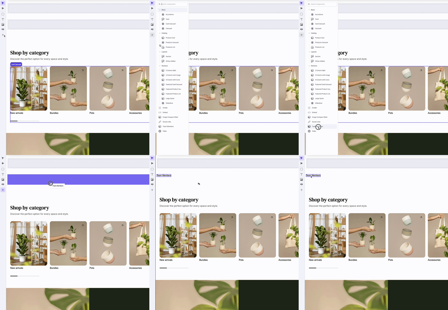
- Browse to the Makeswift editor with the appropriate site selected and verify that your “Team Members” component is available to drag into the editor viewport.
Step 2: Add List Control
In this step, you’ll add a List prop control to allow the management of each individual team member.
- Open the file components/custom/team-members/register.tsx and add the following prop definition:
This List prop defines a collection of items that are each, in turn, a Group with several simple properties.
- Open components/custom/team-members/team-members.tsx and add the right prop type definitions and some initial placeholder JSX.
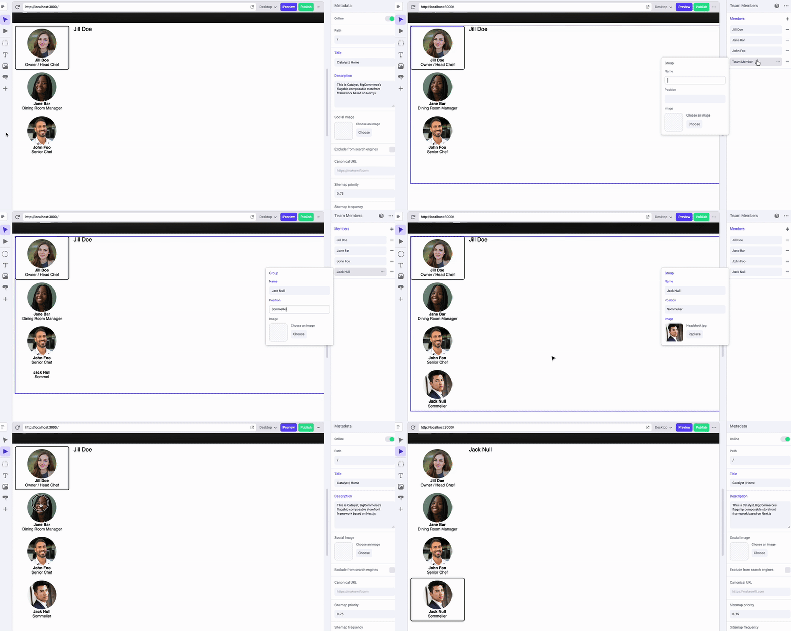
- Verify in the editor that Members can be added and that the count in the placeholder text changes accordingly.

Step 3: Implement the Main Presentation
Let’s flesh out the details of how the team members are presented, including the basic wiring for the animated transitions.
- Open the file components/custom/team-members/team-members.tsx and add some basic state variables.
The value of vertical is static for now, but you’ll make it dynamic based on a prop later. This value controls whether the gallery thumbnails are presented in a vertical or horizontal layout, and starting out with the value defined allows you to include the appropriate logic for various style classes now instead of adding them in later.
- Edit the component’s JSX with a basic starting presentation.
This loops through the members list twice to give us each item’s thumbnail and main content (which is simply a placeholder for now). Most of the required style classes are already in place, and you can see that some of them rely on logic related to a couple of pieces of state: The “active” member is the currently selected item, and there is also a broader list of “visible” members. We’ll see why these are needed next.
- Edit the changeActiveMember function to flesh out the logic.
The fade in/out transition used when a new thumbnail is clicked requires that both the previous active item and the new one briefly be visible at the same time. While you could simply render all items, leaving all but the active one with an opacity of 0, this would create an issue in the Makeswift editor. Visible or not, the overlapped elements present in the DOM would interfere with the ability to interact with the slots you’ll eventually be implementing.
To deal with this, changeActiveMember uses a timeout-based approach to allow both items to be rendered for a sufficient length of time to accommodate the fade transition. Once this process is complete, only the active item is rendered.
- In the Makeswift editor, add a few Team Members with full details and verify the working presentation by using the Interact mode.
Step 4: Add Formatting Props
Let’s spruce up the functionality of the component by adding controls for colors and the thumbnail layout.
- Open components/custom/team-members/register.tsx and add new prop definitions.
- Open components/custom/team-members/team-members.tsx and modify the component code to receive the new props and adjust the value of vertical to depend on your thumbnailOrientation prop.
- Modify the JSX for the <ul> and <li> elements to incorporate the various properties into the logic for the style classes used.
Note the technique used here to incorporate dynamic values into the Tailwind classes applied to the content. First, a style prop is included using the dynamic values to set CSS variables. These variables are then utilized with Tailwind’s syntax for arbitrary values. (For example, text-[var(—textColor)] )
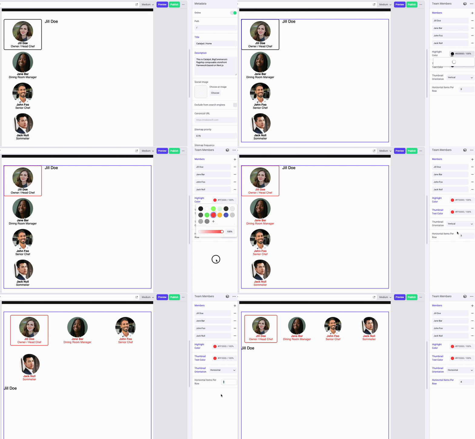
- Verify the functionality of your new props in the editor.
Step 5: Add a Slot Control
Let’s turn our attention to the main content for each team member profile. There are a couple of approaches that could be used here.
If, practically speaking, the visual formatting of each profile will be identical, then it might be cumbersome for content authors to visually build each one using Makeswift’s standard components. In this case, you might choose to expand the properties available for each “Team Members” item and output specific HTML structure using those values, as you’ve done for the thumbnails.
However, to give content authors maximum freedom over the presentation of each profile, the appropriate approach would be to allow each profile’s content to be fully free-form, with full support for visual editing. This is the approach you’ll take in the following steps, and all that’s required is to utilize a Slot control for each list item.
By the same token, you might have chosen just such a free-form strategy for the gallery thumbnails, outputting a thumbnail Slot for each rather than exposing specific fields like Name and Position at all.
- Open components/custom/team-members/register.tsx and add a simple Slot prop for each Group in the members list.
- Open components/custom/team-members/team-members.tsx and add the new prop in place of the placeholder text that previously populated each item.
- Test the visual editing capability of each team member. Note that you’ll need to toggle between the Move and Interact modes in the editor to switch to and then edit each item in the viewport.
Step 6: Add Style Control
Finally, let’s once again add a Style control to allow content authors to fully manipulate the component’s sizing, spacing, etc. In this case, it’s valid to edit any of the available Style properties, including text format.
- Open components/custom/team-members/register.tsx and add the Style prop.
- Open components/custom/team-members/team-members.tsx and add the className prop.
- Verify that your new Style control works properly in the editor.
Full Lab Code
Taking It Further
- Try a different strategy for the main content presentation for each team member. Expand the Group properties to include appropriate values like “Main Image” and “Profile Content,” then implement an appropriate JSX structure to output these. Consider what additional properties would allow reasonable control over the styling of this content.
- The component as implemented is displayed reasonably at most breakpoints but is not a good fit for the smallest mobile sizes. (An author’s best option would be to hide the whole component at this breakpoint and build a mobile-specific presentation of the same content.) Plan and implement a mobile-friendly presentation of the interactive component.