> This page is for Developer.
> For clean Markdown of any page, append .md to the page URL.
> For a complete documentation index, see https://docs.bigcommerce.com/llms.txt.
> For AI client integration (Claude Code, Cursor, etc.), connect to the MCP server at https://docs.bigcommerce.com/_mcp/server.
# Lab Activity: Add React Components with NPM
Plan: Stencil Developer
Lesson 19 of 31 · 45 min
In this lab activity, we'll be making a drawer that sends a coupon code to the customer's email using Material UI's React framework.
**Objectives**
* Add npm package to the theme
* Install React to npm packages
* Update webpack.common.js
* Create components
* Import dependencies
* Add the coupondrawer div to base.html
* View finished product
**Prerequisites**
* Stencil CLI installed
* BigCommerce store
* Cornerstone Stencil theme with npm installed
* Knowledge of HTML and JavaScript
## Adding npm Packages to a Theme
Stencil's architecture allows for organized customization using npm and React. In production, you can use these tools for stylizing seasonally themed products, temporary promotions, or event tickets. Below is a short tutorial on using npm and React to customize your Stencil theme.
The resulting customization will look like the following:
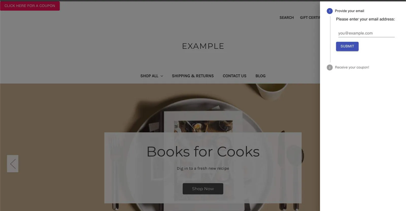
You should have most of the following already setup. Use the steps to verify as you go through this activity.
## Installing React to npm packages
To build this customization, complete the instructions in the following sections.
### Install dependencies
For this activity, we'll be using packages from [MUI Core](https://material-ui.com/). These components require certain modules.
Navigate into the root Cornerstone theme folder, then install the following npm packages.
```bash showLineNumbers={false}
# navigate into theme dir
cd ~/path/to/theme/dir
# install dependencies
npm install --save-dev @material-ui/core react react-dom babel-plugin-transform-object-assign @babel/preset-react
```
### Update webpack.common.js
Update *webpack.common*.js with the new presets and plugins.
```js showLineNumbers={false}
...
plugins: [
...
'transform-object-assign',
],
```
```js showLineNumbers={false}
...
presets: [
['@babel/preset-env', {
...
}], '@babel/react',
],
```
### Create components
In the following steps, we'll be adding React components to assemble our coupon drawer.
1. **Navigate** to the *./assets/js* folder
2. **Create** a */components* folder within the */js* folder
3. **Navigate** into the */components* folder
4. **Create** a *CouponDrawer.js* file
5. **Copy** the following code into the file:
```js showLineNumbers={false}
import React from 'react';
import { makeStyles } from '@material-ui/core/styles';
import Drawer from '@material-ui/core/Drawer';
import Button from '@material-ui/core/Button';
import List from '@material-ui/core/List';
import Divider from '@material-ui/core/Divider';
import ListItem from '@material-ui/core/ListItem';
import ListItemText from '@material-ui/core/ListItemText';
import VerticalStepper from './VerticalStepper';
export default function CouponDrawer() {
const [state, setState] = React.useState({
right: false,
});
const toggleDrawer = (side, open) => event => {
if (event.type === 'keydown' && (event.key === 'Tab' || event.key === 'Shift')) {
return;
}
setState({ ...state, [side]: open });
};
return (
);
}
```
6. In the same */components* folder, **create** a *VerticalStepper.js* file
7. **Copy** the following code into the file:
```js showLineNumbers={false}
import React from 'react';
import { makeStyles } from '@material-ui/core/styles';
import Stepper from '@material-ui/core/Stepper';
import Step from '@material-ui/core/Step';
import StepLabel from '@material-ui/core/StepLabel';
import StepContent from '@material-ui/core/StepContent';
import Button from '@material-ui/core/Button';
import Typography from '@material-ui/core/Typography';
import TextField from './TextField';
const useStyles = makeStyles(theme => ({
root: {
width: '100%',
},
button: {
marginTop: theme.spacing(1),
marginRight: theme.spacing(1),
},
actionsContainer: {
marginBottom: theme.spacing(2),
},
resetContainer: {
padding: theme.spacing(3),
},
}));
function getSteps() {
return ['Provide your email', 'Receive your coupon!'];
}
function getStepContent(step) {
switch (step) {
case 0:
return `Please enter your email address:`;
case 1:
return `We have sent a coupon code to your email address.`;
default:
return `Unknown step`;
}
}
export default function VerticalLinearStepper() {
const classes = useStyles();
const [activeStep, setActiveStep] = React.useState(0);
const steps = getSteps();
const handleNext = () => {
setActiveStep(prevActiveStep => prevActiveStep + 1);
};
return (
);
}
```
8. In the same */components* folder, **create** a *TextField.js* file
9. **Copy** the following code into the file:
```js showLineNumbers={false}
import React from 'react';
import { makeStyles } from '@material-ui/core/styles';
import TextField from '@material-ui/core/TextField';
const useStyles = makeStyles(theme => ({
root: {
'& > *': {
margin: theme.spacing(1),
width: 200,
},
},
}));
export default function BasicTextFields() {
const classes = useStyles();
return (
);
}
```
### Import Dependencies
1. **Import** the React dependencies and the new CouponDrawer component we've created into *assets/js/app.js*:
```js showLineNumbers={false}
__webpack_public_path__ = window.__webpack_public_path__; // eslint-disable-line
import Global from './theme/global';
import React from 'react';
import ReactDOM from 'react-dom';
import CouponDrawer from './components/CouponDrawer';
```
2. At the bottom of the file, **render** the *CouponDrawer* component and **assign** it an id
```js showLineNumbers={false}
ReactDOM.render(, document.querySelector('#coupondrawer'));
```
### Add the CouponDrawer div to base.html
1. **Navigate** to *templates/layout/base.html*
2. **Add** a new div element with our new id inside the body
```jsx showLineNumbers={false}
...
{{> components/common/header }}
{{> components/common/body }}
{{> components/common/footer }}
{{{footer.scripts}}}
```
### Final Product
1. **View** the finished product using the Stencil CLI command *stencil start* in the Cornerstone theme directory
```bash showLineNumbers={false}
# move into theme dir
cd ~/path/to/theme/dir
# Preview store using Browsersync
stencil start
```
2. **Open** your browser and **navigate** to *localhost:3000* to **view** your local storefront
> **Info**
>
> Note: This coupon drawer example does not send coupon codes to the emails entered. This is only an example to show how to customize your storefront theme.