> This page is for Developer.
> For clean Markdown of any page, append .md to the page URL.
> For a complete documentation index, see https://docs.bigcommerce.com/llms.txt.
> For AI client integration (Claude Code, Cursor, etc.), connect to the MCP server at https://docs.bigcommerce.com/_mcp/server.
# Optional Lab - Enable Makeswift for a Third-Party Component
Plan: Composable Developer
Lesson 15 of 22 · 45 min
In this first exercise in creating Makeswift-enabled components, you'll take a pre-existing, open-source React component and simply "wrap" an implementation of it for use in the visual editor.
### In this lab, you will:
* Enable a React comparison slider component for use within the Makeswift builder
* Make use of the Makeswift *Image* and *Style* controls
### Prerequisites
* The [starter codebase](https://github.com/bigcommerce-edu/lab-catalyst-makeswift-faqs) installed and connected with your BigCommerce store and Makeswift site, as done in the previous setup lab
### Setup
Double check that the right site API key is present in your *.env.local* file.
Make sure your local dev server is running in your custom Makeswift project by using the following command in the root directory:
```text showLineNumbers={false}
pnpm run dev
```
Sign into the Makeswift editor and make sure the appropriate site is chosen and that the Host URL matches the localhost domain your server is running on.
> **Info**
>
> **Remember!**
>
> These exercises will proceed from the project you previously set up from the lab repository, which already contains boilerplate code these steps rely on. Revisit the initial setup lab in this course if necessary to get your project set up.
### Lab Reference Copy
If it's helpful to compare your own code as you go, you can clone or download the completed version of this lab as a reference.
[Image Compare Slider Component Lab Snapshot](https://github.com/bigcommerce-edu/lab-catalyst-makeswift-faqs/tree/e-img-comp-complete)
## The React Compare Slider Component
You'll be implementing a component called React Compare Slider, which is available for installation via *npm*.
This component presents an interactive slider interface for comparing two pieces of content.
.gif)
Our goal is to create a simple implementation of this comparison slider with two images, enabling this as a Makeswift component that can supply those images with editor controls.
## Step 1: Register the Component
The project boilerplate already includes the *ImageCompareSlider* component with placeholder text. Your first step is simply to register the component so it can be used in the Makeswift builder.
1. **Open** the file *components/custom/image-compare-slider/register.tsx* and **add** the *registerComponent* call immediately after the imports.
```java showLineNumbers={false}
runtime.registerComponent(
ImageCompareSlider,
{
type: 'img-compare-slider',
label: 'Image Compare Slider',
props: {
},
}
);
```
You have no prop controls defined at this time, but this registration will make it available to the Makeswift runtime. The only other step that's necessary is to make sure this registration is imported when a page renders.
2. **Open** the file *lib/makeswift/components.ts* and **add** the following import.
```js showLineNumbers={false}
import '~/components/custom/image-compare-slider/register';
```
3. **Browse** to the Makeswift editor with the appropriate site selected and **verify** that your "Image Compare Slider" component is available to drag into the editor viewport.

[Example Code](https://github.com/bigcommerce-edu/lab-catalyst-makeswift-faqs/compare/e-img-comp-01-pre...e-img-comp-01-post?diff=split)
## Step 2: Add react-compare-slider
Now you'll bring the real *ReactCompareSlider* component into your own, albeit still with placeholder content.
1. **Open** the file *components/custom/image-compare-slider/image-compare-slider.tsx* and **add** an import for the proper components.
```js showLineNumbers={false}
import { ReactCompareSlider, ReactCompareSliderImage } from 'react-compare-slider';
```
2. **Modify** the placeholder content within the *ImageCompareSlider* JSX as follows:
```jsx {8-19} showLineNumbers={false}
export const ImageCompareSlider = forwardRef((
// ...
) => {
return (
}
itemTwo={
}
/>
);
});
```
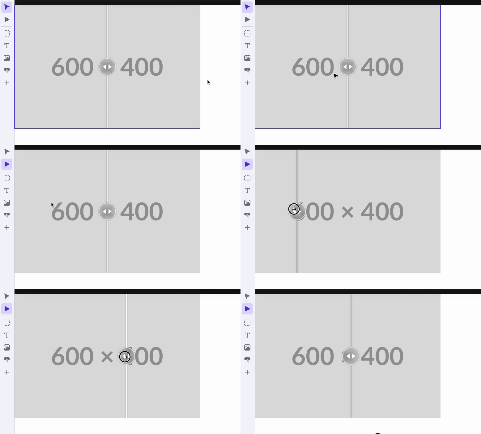
3. **Browse** to the Makeswift editor again and **verify** that the component now appears as a working slider with two (identical) placeholder images.
[Example Code](https://github.com/bigcommerce-edu/lab-catalyst-makeswift-faqs/compare/e-img-comp-02-pre...e-img-comp-02-post?diff=split)
## Step 3: Add Image Controls
For a fully functional Makeswift component, you need the ability to control the images presented using the editor.
1. **Open** the file *components/custom/image-compare-slider/register.tsx* and **add** two props with *Image* controls.
```java {6-13} showLineNumbers={false}
runtime.registerComponent(
ImageCompareSlider,
{
// ...
props: {
image1: Image({
label: "Image 1",
format: Image.Format.URL,
}),
image2: Image({
label: "Image 2",
format: Image.Format.URL,
}),
},
}
);
```
Note the use of *Image.Format.URL* for the format. You won't need to know the dimensions of the images, so this simple format will give you just the image URL as a string in the prop.
2. **Open** *components/custom/image-compare-slider/image-compare-slider.tsx* and **modify** the component code as follows, defining the new props and utilizing them for the image *src* attributes.
```jsx {4-5,10-11,22,27} showLineNumbers={false}
// ...
interface Props {
image1?: string;
image2?: string;
}
export const ImageCompareSlider = forwardRef((
{
image1 = "https://placehold.co/600x400",
image2 = "https://placehold.co/600x400",
}: Props,
ref: Ref
) => {
return (
}
itemTwo={
}
/>
);
});
// ...
```
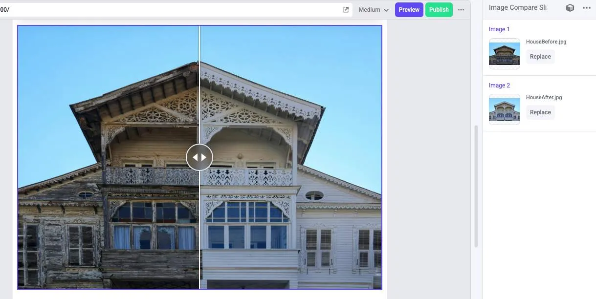
3. **Verify** in the editor interface that your new controls appear in the properties panel and successfully affect the component.
[Example Code](https://github.com/bigcommerce-edu/lab-catalyst-makeswift-faqs/compare/e-img-comp-03-pre...e-img-comp-03-post?diff=split)
## Step 4: Add Style Control
To make your new component maximally flexible in the editor, it would be best for its sizing, spacing, and border properties to be editable, which you can do with a *Style* control.
1. **Open** the file *components/custom/image-compare-slider/register.tsx* and add the *className* prop.
```java {6-14} showLineNumbers={false}
runtime.registerComponent(
ImageCompareSlider,
{
// ...
props: {
className: Style({
properties: [
Style.Width,
Style.Margin,
Style.Padding,
Style.Border,
Style.BorderRadius
],
}),
image1: Image({
// ...
}),
// ...
},
}
);
```
The component doesn't involve any text, so you're specifying a list of supported properties excluding the text formatting controls.
2. **Open** *components/custom/image-compare-slider/image-compare-slider.tsx* and **add** the prop. You simply need to pass it to the *className* of the container element to apply all properties.
```jsx {4,10,18-19} showLineNumbers={false}
// ...
interface Props {
className?: string;
// ...
}
export const ImageCompareSlider = forwardRef((
{
className,
// ...
}: Props,
ref: Ref
) => {
return (
{/* ... */}
);
});
// ...
```
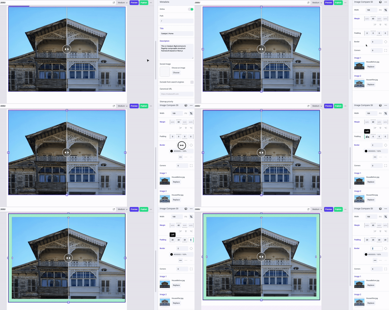
3. **Verify** the functionality of your new style controls in the editor.
[Example Code](https://github.com/bigcommerce-edu/lab-catalyst-makeswift-faqs/compare/e-img-comp-04-pre...e-img-comp-04-post?diff=split)
## Full Lab Code
[Full Lab Code](https://github.com/bigcommerce-edu/lab-catalyst-makeswift-faqs/compare/e-makeswift-start...e-img-comp-complete?diff=split)
## Taking It Further
The React Compare Slider component includes a number of props to vary the interactive experience, such as props for changing the interaction method to hover instead of drag or for applying a top-to-bottom slider instead of side-to-side.
See the full list of props on the [npm info page](https://www.npmjs.com/package/react-compare-slider).
Try selecting a few of these props to support in your own component, then implement appropriate Makeswift controls for them and pass the values through in your own component code.