> This page is for Developer.
> For clean Markdown of any page, append .md to the page URL.
> For a complete documentation index, see https://docs.bigcommerce.com/llms.txt.
> For AI client integration (Claude Code, Cursor, etc.), connect to the MCP server at https://docs.bigcommerce.com/_mcp/server.
# Using npm and React to Customize Your Theme
Stencil's architecture allows for organized customization using npm and React. In production, you can use these tools for stylizing seasonally themed products, temporary promotions, or event tickets. Below is a short tutorial on using npm and React to customize your Stencil theme.
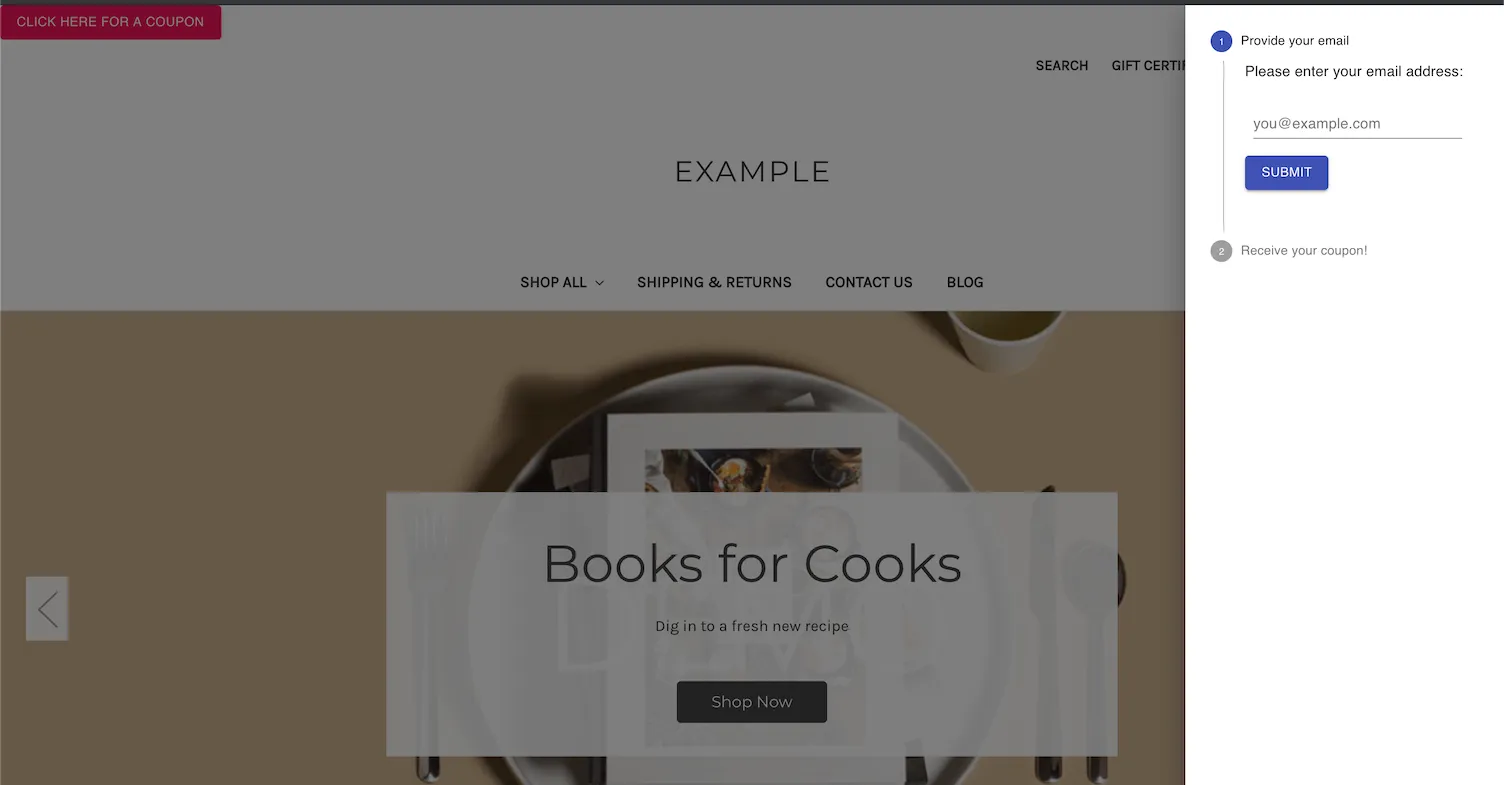
In this example, we'll be making a drawer that sends a coupon code to the customer's email using Material UI's React framework. The resulting customization will look like the following:
### Prerequisites
* Stencil CLI installed
* BigCommerce store
* Cornerstone Stencil theme with npm installed
* Knowledge of HTML and JavaScript
To set up a BigCommerce store, see [Creating a Trial Store](https://support.bigcommerce.com/s/article/Starting-a-Bigcommerce-Trial#creating).
## Installing React and npm packages
To build this customization, complete the instructions in the following sections.
### Install dependencies
For this example, we'll be using packages from [Material-UI](https://material-ui.com/). These components require certain modules.
Navigate into the root Cornerstone theme folder, then install the following npm packages.
```shell showLineNumbers={false}
# navigate into theme dir
cd ~/path/to/theme/dir
# install dependencies
npm install react react-dom @mui/material @mui/styles @emotion/react @emotion/styled
npm install --save-dev @babel/preset-react
```
### Update webpack.common.js
Update` webpack.common.js` with the React preset.
**`Example 2: New presets and plugins`**
```js title="Example 2: New presets and plugins" showLineNumbers={false}
...
presets: [
['@babel/preset-env', {
...
}], '@babel/react',
],
```
### Create components
In the following steps, we'll be adding React components to assemble our coupon drawer.
1. Navigate to the `./assets/js` folder.
2. Create a `/components` folder within the `/js` folder.
3. Navigate into the `/components` folder.
4. Create a `CouponDrawer.js` file.
5. Copy the following code into the file:
**`CouponDrawer.js`**
```js title="CouponDrawer.js" showLineNumbers={false}
import React from 'react';
import Drawer from '@mui/material/Drawer';
import Button from '@mui/material/Button';
import Box from '@mui/material/Box';
import VerticalStepper from './VerticalStepper';
export default function CouponDrawer() {
const [state, setState] = React.useState({
right: false,
});
const toggleDrawer = (side, open) => (event) => {
if (
event.type === 'keydown' &&
(event.key === 'Tab' || event.key === 'Shift')
) {
return;
}
setState((prevState) => ({ ...prevState, [side]: open }));
};
return (
);
}
```
6. In the same `/components` folder, create a `VerticalStepper.js` file.
7. Copy the following code into the file:
**`VerticalStepper.js`**
```js title="VerticalStepper.js" showLineNumbers={false}
import React from "react";
import Stepper from "@mui/material/Stepper";
import Step from "@mui/material/Step";
import StepLabel from "@mui/material/StepLabel";
import StepContent from "@mui/material/StepContent";
import Button from "@mui/material/Button";
import Typography from "@mui/material/Typography";
import Box from "@mui/material/Box";
import TextField from "./TextField";
function getSteps() {
return ["Provide your email", "Receive your coupon!"];
}
function getStepContent(step) {
switch (step) {
case 0:
return "Please enter your email address:";
case 1:
return "We have sent a coupon code to your email address.";
default:
return "Unknown step";
}
}
export default function VerticalLinearStepper() {
const [activeStep, setActiveStep] = React.useState(0);
const steps = getSteps();
const handleNext = () => {
setActiveStep((prevActiveStep) => prevActiveStep + 1);
};
return (
{steps.map((label, index) => (
{label}{getStepContent(index)}
{activeStep === 0 ? : null}
{activeStep === 0 && (
)}
))}
);
}
```
8. In the same `/components` folder, create a `TextField.js` file.
9. Copy the following code into the file:
**`TextField.js`**
```js title="TextField.js" showLineNumbers={false}
import React from 'react';
import TextField from '@mui/material/TextField';
import Box from '@mui/material/Box';
export default function BasicTextFields() {
return (
*': {
m: 1,
width: '200px',
},
}}
noValidate
autoComplete="off"
>
);
}
```
### Import dependencies
1. Import the React dependencies and the new CouponDrawer component we've created into `assets/js/app.js` while also creating a theme instance for Material UI:
**`assets/js/app.js`**
```js title="assets/js/app.js" showLineNumbers={false}
__webpack_public_path__ = window.__webpack_public_path__; // eslint-disable-line
import Global from "./theme/global";
import React from "react";
import { createRoot } from "react-dom/client";
import { ThemeProvider, createTheme } from "@mui/material/styles";
import CssBaseline from "@mui/material/CssBaseline";
import CouponDrawer from "./components/CouponDrawer";
const theme = createTheme({
palette: {
primary: {
main: "#555555", // Customize to match your brand
},
secondary: {
main: "#f44336", // Customize to match your brand
},
},
});
```
2. At the bottom of the file, render the `CouponDrawer` component and assign it an id.
**`Render CouponDrawer component`**
```js title="Render CouponDrawer component" showLineNumbers={false}
const couponContainer = document.querySelector("#coupondrawer");
if (couponContainer) {
const root = createRoot(couponContainer);
root.render(
);
}
```
### Add the CouponDrawer div to base.html
1. Navigate to `templates/layout/base.html`.
2. Add a new div element with our new id inside the body.
**`templates/layout/base.html`**
```handlebars title="templates/layout/base.html" showLineNumbers={false}
...
{{> components/common/header }}
{{> components/common/body }}
{{> components/common/footer }}
...
```
## Final product
View the finished product using the Stencil CLI command `stencil start` in the Cornerstone theme directory.
**`stencil start`**
```shell title="stencil start" showLineNumbers={false}
# move into theme dir
cd ~/path/to/theme/dir
# Preview store using Browsersync
stencil start
```
Open your browser and navigate to `localhost:3000` to view your local storefront.
**Note:** This coupon drawer example does not send coupon codes to the emails entered. This is only an example to show how to customize your storefront theme.