> This page is for Developer.
> For clean Markdown of any page, append .md to the page URL.
> For a complete documentation index, see https://docs.bigcommerce.com/llms.txt.
> For AI client integration (Claude Code, Cursor, etc.), connect to the MCP server at https://docs.bigcommerce.com/_mcp/server.
# 1: Build a UI with BigDesign
> Add BigDesign to the root layout and build a mock-data gift certificates list and detail UI.
This exercise runs entirely in `MOCK` mode — `DATA_MODE=MOCK` in `.env.local`, the setting your project already uses from the initial setup. No real API requests are made, and the mock data you need ships with the boilerplate, so you don't need BigCommerce credentials or a store yet.
By the end of this exercise, your app renders a working gift certificates list and detail page, styled with [BigDesign](https://developer.bigcommerce.com/big-design), BigCommerce's React design system.
## Install the BigDesign packages
BigDesign isn't part of the project boilerplate, so your first task is to add it.
**Run** the following command in your project directory to install BigDesign and `styled-components`.
**`Install BigDesign`**
```shell title="Install BigDesign" showLineNumbers={false}
pnpm install @bigcommerce/big-design@latest @bigcommerce/big-design-icons@latest @bigcommerce/big-design-theme@latest styled-components@6
```
`@bigcommerce/big-design` provides the components themselves, `-theme` supplies the design tokens the components read, and `-icons` is BigDesign's icon set. `styled-components` is the CSS-in-JS library BigDesign is built on, so it's a direct dependency of your app rather than just a transitive one.
> **Info**
>
> `styled-components` v6 ships its own TypeScript types, so no separate `@types/styled-components` package is needed.
**Update** `pnpm-workspace.yaml` with the following:
**`pnpm-workspace.yaml`**
```yaml {3-4} showLineNumbers={false} title="pnpm-workspace.yaml"
- sharp
- unrs-resolver
patchedDependencies:
'@bigcommerce/big-design': patches/@bigcommerce__big-design+modal-removechild-detached-node.patch
```
Now re-run `pnpm install` so pnpm applies the patch to the package you just installed.
> **Note**
>
> This patch, already included with the boilerplate, fixes a small issue with BigDesign modals in Next.js. See
> [the patch notes](https://github.com/bigcommerce-edu/starter-sc-app-next/blob/main/docs/big-design-modal-removechild-patch.md)
> in the repository documentation for the full details.
[Example code](https://github.com/bigcommerce-edu/starter-sc-app-next/compare/e-ui-01-pre...e-ui-01-post?diff=split)
## Wire BigDesign into the root layout
BigDesign is `styled-components` based, so getting it working in a Next.js App Router project takes a few pieces of setup. In this section, you'll make the layout modifications that wire BigDesign into the UI.
### Enable the styled-components compiler transform
**Update** `next.config.ts` to enable the `styled-components` compiler transform.
**`next.config.ts`**
```js {2-4} showLineNumbers={false} title="next.config.ts"
const nextConfig: NextConfig = {
compiler: {
styledComponents: true,
},
experimental: {
...
},
};
```
Without this setting, `styled-components` generates class names at runtime in an order that can differ between the server's render and the client's first hydration pass.
### Create the BigDesign provider
**Update** `src/components/ui/big-design-provider.tsx`.
**`big-design-provider.tsx`**
```jsx {1-6,8-13} showLineNumbers={false} title="big-design-provider.tsx"
"use client";
import { GlobalStyles } from "@bigcommerce/big-design";
import { theme } from "@bigcommerce/big-design-theme";
import { ThemeProvider } from "styled-components";
export function BigDesignProvider({ children }: { children: React.ReactNode }) {
return (
{children}
);
}
```
> **Info**
>
> #### BigDesign components are Client Components
>
> Note the `"use client"` directive at the top of this file. BigDesign's components are Client Components: they rely on browser APIs, React state, and `styled-components`' runtime, none of which exist during a server render.
>
> In the Next.js App Router, every component is a Server Component by default — rendered on the server, never shipped to the browser, and unable to use hooks or event handlers. `"use client"` marks the boundary where that changes. A file with the directive, and everything it imports, is bundled for the browser and hydrated there.
>
> BigDesign declares this boundary itself, so you can import its components directly from `@bigcommerce/big-design` into a Server Component and render them without adding `"use client"` to your own file. You only need the directive when *your* component needs client-side behavior of its own — state, effects, or event handlers — as this provider does.
### Create the styled-components registry
**Update** `src/components/ui/styled-components-registry.tsx`.
**`styled-components-registry.tsx`**
```jsx {1-6,8-18} showLineNumbers={false} title="styled-components-registry.tsx"
"use client";
import { useState } from "react";
import { useServerInsertedHTML } from "next/navigation";
import { ServerStyleSheet, StyleSheetManager } from "styled-components";
export function StyledComponentsRegistry({ children }: { children: React.ReactNode }) {
const [sheet] = useState(() => new ServerStyleSheet());
useServerInsertedHTML(() => {
const styles = sheet.getStyleElement();
sheet.instance.clearTag();
return <>{styles};
});
if (typeof window !== "undefined") return <>{children};
return {children};
}
```
### Add registry/providers in the root layout
**Update** `src/app/layout.tsx` to **remove** font-related imports and constants.
**`app/layout.tsx`**
```jsx showLineNumbers={false} title="app/layout.tsx"
// Remove these lines
// import { Geist, Geist_Mono } from "next/font/google";
// import "./globals.css";
// const geistSans = Geist({
// ...
// });
// const geistMono = Geist_Mono({
// ...
// });
```
**Update** the same file to wire in the `styled-components` registry, the proper font, the BigDesign provider, and the alerts manager around your app's children.
**`app/layout.tsx`**
```jsx {2-5,7,12-13,20-28} showLineNumbers={false} title="app/layout.tsx"
import type { Metadata } from "next";
import { Source_Sans_3 } from "next/font/google";
import { BigDesignProvider } from "@/components/ui/big-design-provider";
import { StyledComponentsRegistry } from "@/components/ui/styled-components-registry";
import { ActionAlertsManager } from "@/components/ui/action-alerts";
const sourceSans3 = Source_Sans_3({
subsets: ["latin"],
});
export const metadata: Metadata = {
title: "Gift Certificates Manager",
description: "A BigCommerce single-click app for managing gift certificates.",
};
export default function RootLayout({
...
}>) {
return (
{children}
);
}
```
`StyledComponentsRegistry` collects `styled-components`' server-rendered styles so they ship with the SSR payload instead of flashing unstyled, and `BigDesignProvider` supplies the styled-components `ThemeProvider` (with BigDesign's theme) plus `GlobalStyles`. `ActionAlertsManager` is a single, app-wide manager that renders whatever alert a server action queues from anywhere in the tree.
### Delete unneeded CSS file
**Delete** `src/app/globals.css`.
With these pieces in place, restart your dev server and confirm the app still loads without hydration warnings in the console. Nothing visually changes yet; this section only wires up the machinery the rest of the exercise depends on.
[Example code](https://github.com/bigcommerce-edu/starter-sc-app-next/compare/e-ui-02-pre...e-ui-02-post?diff=split)
## Convert main layout components to BigDesign
A few of the UI primitives already in place in the project's boilerplate should be updated to use BigDesign components before we proceed with
building out the gift certificate pages.
### Rebuild the app shell
**Open** `src/components/gift-certs-manager/app-shell.tsx` and **remove** existing imports for UI components.
**`app-shell.tsx`**
```jsx showLineNumbers={false} title="app-shell.tsx"
// Remove these imports
// import { Box } from "@/components/ui/box";
// import { Flex, FlexItem } from "@/components/ui/flex";
```
**Update** the same file to rebuild it with BigDesign's layout primitives.
**`app-shell.tsx`**
```jsx {1,11-17} showLineNumbers={false} title="app-shell.tsx"
import { Box, Flex, FlexItem } from "@bigcommerce/big-design";
import { DataModeBanner } from "@/components/layout/data-mode-banner";
import { DeveloperInfoPanel } from "@/components/layout/developer-info-panel";
...
export function AppShell({ children }: { children: React.ReactNode }) {
return (
{children}
...
);
}
```
### Rebuild the alerts manager
**Update** `src/components/ui/action-alerts.tsx` to **remove** the `useSyncExternalStore` import and all logic before `showSuccessAlert`.
**`action-alerts.tsx`**
```jsx showLineNumbers={false} title="action-alerts.tsx"
// Remove this import
// import { useSyncExternalStore } from "react";
...
// Remove all this
// interface Alert {
// ...
// }
// let alerts: Alert[] = [];
// let nextId = 1;
// const listeners = new Set<() => void>();
// function notify(): void {
// ...
// }
// function subscribe(listener: () => void): () => void {
// ...
// }
// function getSnapshot(): Alert[] {
// ...
// }
// function dismiss(id: number): void {
// ...
// }
// function addAlert(type: Alert["type"], text: string, autoDismiss: boolean): void {
// ...
// }
```
**Update** the same file as shown below.
**`action-alerts.tsx`**
```jsx {3-4,7,10-14,18-22,28} showLineNumbers={false} title="action-alerts.tsx"
"use client";
import { createAlertsManager } from "@bigcommerce/big-design";
import { AlertsManager } from "@bigcommerce/big-design";
import { ActionResult } from "@/lib/actions/action-result";
const alertsManager = createAlertsManager();
export function showSuccessAlert(message: string): void {
alertsManager.add({
autoDismiss: true,
messages: [{ text: message }],
type: "success",
});
}
export function showErrorAlert(message: string): void {
alertsManager.add({
autoDismiss: false,
messages: [{ text: message }],
type: "error",
});
}
...
export function ActionAlertsManager() {
return ;
}
```
This component manages alerts for the whole app. The updates replace the custom implementation with a simple render of the existing BigDesign `AlertsManager`,
as well as implementing the appropriate manager `add` calls.
### Rebuild the app link
**Update** `src/components/ui/app-link.tsx`.
**`app-link.tsx`**
```js {4,6-20} showLineNumbers={false} title="app-link.tsx"
"use client";
import NextLink from "next/link";
import styled from "styled-components";
export const AppLink = styled(NextLink)`
color: ${({ theme }) => theme.colors.primary};
cursor: pointer;
font-size: ${({ theme }) => theme.typography.fontSize.medium};
font-weight: ${({ theme }) => theme.typography.fontWeight.regular};
text-decoration: none;
&:active {
color: ${({ theme }) => theme.colors.primary70};
}
&:hover:not(:active) {
color: ${({ theme }) => theme.colors.primary70};
}
`;
```
Navigation links within the app remain a custom (albeit thin) component. This component combines native Next.js links (exhibiting proper client-side navigation behavior) with style decoration matching BigDesign's theme.
### Rebuild the content fallback
**Update** the imports in `src/components/layout/content-fallback.tsx`. This is an important "loading" fallback state when caching and `` are in use.
Nothing about the component implementation needs to change; `Flex` and `ProgressCircle` simply get replaced with BigDesign-native components instead of custom primitives.
**`content-fallback.tsx`**
```jsx showLineNumbers={false} title="content-fallback.tsx"
import { Flex, ProgressCircle } from "@bigcommerce/big-design";
```
### Rebuild the data mode banner
**Update** the imports in `src/components/layout/data-mode-banner.tsx`. This banner reminds users when the app is running in a non-production mode.
**`data-mode-banner.tsx`**
```js {1} showLineNumbers={false} title="data-mode-banner.tsx"
import { Box, InlineMessage } from "@bigcommerce/big-design";
import { getDataMode } from "@/lib/bc-api-client/data-mode";
```
### Rebuild the developer info panel
**Update** the imports in `src/components/layout/developer-info-panel.tsx`. This side panel identifies the app developer information.
**`developer-info-panel.tsx`**
```js {2-3} showLineNumbers={false} title="developer-info-panel.tsx"
import Image from "next/image";
import { Box, Flex, H4, Link, Panel, Small, Text } from "@bigcommerce/big-design";
import { BaselineHelpIcon } from "@bigcommerce/big-design-icons";
```
### Rebuild the pending overlay
**Update** the imports in `src/components/ui/pending-overlay.tsx`, which dims already-rendered content and overlays a spinner during a pending client-side action.
**`pending-overlay.tsx`**
```js showLineNumbers={false} title="pending-overlay.tsx"
import { Box, Flex, ProgressCircle } from "@bigcommerce/big-design";
```
### Delete unneeded UI components
Now that they've been replaced with BigDesign components, delete the following files:
* `src/components/ui/inline-message.tsx`
* `src/components/ui/link.tsx`
* `src/components/ui/progress-circle.tsx`
[Example code](https://github.com/bigcommerce-edu/starter-sc-app-next/compare/e-ui-03-pre...e-ui-03-post?diff=split)
## Build the gift certificates list page
You can finally start building out new UI for your gift certificates list page.
You'll use a component pattern common to all page routes in the example app: an outer route component where an authorization and `` boundary will eventually live, a page component where dynamic values are resolved, and a cacheable view component where data fetching is handled and the main UI actually begins.
### Create the gift certificate table
The table that drives the core gift certificate list UI is its own component - a React client component, due to the involvement of browser interactivity.
Note that the client nature of the component necessitates its separation from the view component, which handles data fetching server-side.
**Update** `src/components/gift-certs-manager/gift-certificates/list/gift-certificate-table.tsx` with the table implementation.
**`gift-certificate-table.tsx`**
```jsx showLineNumbers={false} title="gift-certificate-table.tsx"
"use client";
import { useMemo, useState } from "react";
import { usePathname, useRouter } from "next/navigation";
import { Badge, Table, TableColumn } from "@bigcommerce/big-design";
import { AppLink } from "@/components/ui/app-link";
import { PendingOverlay } from "@/components/ui/pending-overlay";
import { buildGiftCertificatesSearchParams } from "@/lib/gift-certs-manager/gift-certificates/query";
import { GIFT_CERTIFICATE_STATUS_BADGE_VARIANT, GIFT_CERTIFICATE_STATUS_LABEL } from "@/lib/gift-certs-manager/gift-certificates/status";
import { GiftCertificate, GiftCertificatesQuery } from "@/lib/gift-certs-manager/gift-certificates/types";
import { getAppUrl } from "@/lib/routing/app-url";
const ITEMS_PER_PAGE_OPTIONS = [10, 20, 50];
const currencyFormatter = new Intl.NumberFormat("en-US", { style: "currency", currency: "USD" });
const dateFormatter = new Intl.DateTimeFormat("en-US", { dateStyle: "medium" });
function getColumns(storeHash: string | undefined): Array> {
return [
{
header: "Certificate #",
hash: "id",
render: ({ id, code }: GiftCertificate) => (
{code}
),
isSortable: true,
},
{
header: "Status",
hash: "status",
render: ({ status }: GiftCertificate) => (
),
},
{
header: "Original Value",
hash: "amount",
render: ({ amount }: GiftCertificate) => currencyFormatter.format(amount),
align: "right",
},
{
header: "Current Balance",
hash: "balance",
render: ({ balance }: GiftCertificate) => currencyFormatter.format(balance),
align: "right",
},
{
header: "Recipient",
hash: "to_name",
render: ({ to_name }: GiftCertificate) => to_name,
},
{
header: "Recipient Email",
hash: "to_email",
render: ({ to_email }: GiftCertificate) => to_email,
},
{
header: "Purchase Date",
hash: "purchase_date",
render: ({ purchase_date }: GiftCertificate) =>
dateFormatter.format(new Date(Number(purchase_date) * 1000)),
},
];
}
interface GiftCertificateTableProps {
giftCertificates: GiftCertificate[];
hasNextPage: boolean;
query: GiftCertificatesQuery;
storeHash: string | undefined;
}
export function GiftCertificateTable({ giftCertificates, hasNextPage, query, storeHash }: GiftCertificateTableProps) {
const router = useRouter();
const pathname = usePathname();
const columns = useMemo(() => getColumns(storeHash), [storeHash]);
const [isPending, setIsPending] = useState(false);
const [lastQuery, setLastQuery] = useState(query);
if (query !== lastQuery) {
setLastQuery(query);
setIsPending(false);
}
const navigate = (nextQuery: GiftCertificatesQuery) => {
const params = buildGiftCertificatesSearchParams(nextQuery);
const queryString = params.toString();
setIsPending(true);
router.push(queryString ? `${pathname}?${queryString}` : pathname);
};
return (
navigate({ ...query, direction }),
}}
pagination={{
itemsPerPage: query.limit,
itemsPerPageOptions: ITEMS_PER_PAGE_OPTIONS,
onPrevious: query.page > 1 ? () => navigate({ ...query, page: query.page - 1 }) : undefined,
onNext: hasNextPage ? () => navigate({ ...query, page: query.page + 1 }) : undefined,
onItemsPerPageChange: (limit) => navigate({ ...query, limit, page: 1 }),
}}
/>
);
}
```
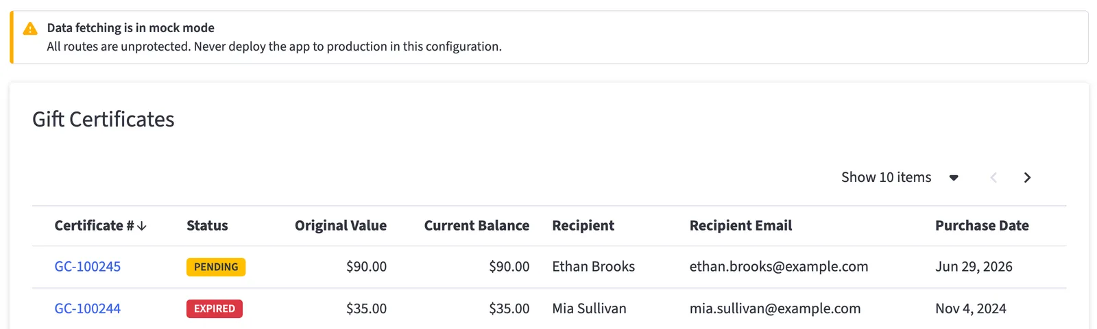
This component is purely presentational: it renders the page of items the server already fetched, and every search, sort, or pagination interaction navigates to a new URL with `router.push` rather than holding its own state or fetching data. The view component you'll build next reads the resulting querystring with `searchParams` and re-fetches server-side, and `PendingOverlay` shows the in-between state.
Note that the BigDesign `Table` component is doing all the heavy lifting of the UI, requiring only props controlling the displayed columns, items, and nagivation behavior.
### Implement the view component
This view component handles data fetching and then hands off rendering to the table component you built in the previous step. The component lives separately from the resolution of dynamic values like querystring params, receiving only
serializable props so it remains cacheable.
**Update** `src/components/gift-certs-manager/gift-certificates/list/gift-certificate-list-view.tsx`.
**`gift-certificate-list-view.tsx`**
```jsx {1-5,13-25} showLineNumbers={false} title="gift-certificate-list-view.tsx"
import { Panel } from "@bigcommerce/big-design";
import { GiftCertificateTable } from "@/components/gift-certs-manager/gift-certificates/list/gift-certificate-table";
import { fetchGiftCertificates } from "@/lib/gift-certs-manager/gift-certificates/gift-certificates-api";
import { parseGiftCertificatesQuery } from "@/lib/gift-certs-manager/gift-certificates/query";
export async function GiftCertificateListView({
searchParams,
storeHash,
}: {
searchParams: Record;
storeHash: string | undefined;
}) {
const query = parseGiftCertificatesQuery(searchParams);
const { items, hasNextPage } = await fetchGiftCertificates(query, storeHash);
return (
);
}
```
**Note** that the component accepts a `storeHash` prop. While this isn't currently used, it's critical to the eventual single-click app implementation, where all app
URLs will include a `/store/` segment identifying the store context.
The data fetching is done with the `fetchGiftCertificates` function that already exists in the project boilerplate. In this exercise, we're concerned only with UI and not
the data access layer. `fetchGiftCertificates` currently returns mock data. `parseGiftCertificatesQuery` turns the raw querystring params into a normalized query object; open and examine the import file if you want to see the details.
### Complete the page component
Proceeding up the component tree, the page component is a quite thin layer, responsible for resolving `params` and `searchParams` and passing dynamic values to the view component as serializable props.
**Update** `src/components/gift-certs-manager/gift-certificates/list/gift-certificates-page.tsx`.
**`gift-certificates-page.tsx`**
```jsx {1-2,10-16} showLineNumbers={false} title="gift-certificates-page.tsx"
import { GiftCertificateListView } from "@/components/gift-certs-manager/gift-certificates/list/gift-certificate-list-view";
export async function GiftCertificatesPage({
params,
searchParams,
}: {
params: Promise>;
searchParams: Promise>;
}) {
const resolvedParams = await params;
const resolvedSearchParams = await searchParams;
const storeHash = resolvedParams.storeHash;
const storeHashString = Array.isArray(storeHash) ? storeHash[0] : storeHash;
return ;
}
```
### Complete the route component
At the top of the hierarchy is the route component itself. Right now this does nothing but render the page component you built in the previous step.
In future exercises, you'll see that the route will become the home of an authorization check.
**Update** `src/app/store/[storeHash]/gift-certs/page.tsx`.
**`gift-certs/page.tsx`**
```jsx showLineNumbers={false} title="gift-certs/page.tsx"
import { GiftCertificatesPage } from "@/components/gift-certs-manager/gift-certificates/list/gift-certificates-page";
export default function Page(props: React.ComponentProps) {
return ;
}
```
Restart your dev server if needed and browse to `/gift-certs` to confirm the table renders with mock data, including working sort and pagination.
[Example code](https://github.com/bigcommerce-edu/starter-sc-app-next/compare/e-ui-04-pre...e-ui-04-post?diff=split)
## Replace the store home page with the gift certificates list
### Update the home page export
**Replace** the contents of `src/app/store/[storeHash]/page.tsx` with a pass-through export to the gift certificates list page you just built.
**`[storeHash]/page.tsx`**
```js showLineNumbers={false} title="[storeHash]/page.tsx"
export { default } from "@/app/store/[storeHash]/gift-certs/page";
```
This step is a convenience, adopting the gift certificate list page as the content of the base route. This convention keeps the example app cleanly separate and easy
to swap out for different home page content.
[Example code](https://github.com/bigcommerce-edu/starter-sc-app-next/compare/e-ui-05-pre...e-ui-05-post?diff=split)
## Build the gift certificate detail page
The core component hierarchy (route, page, and view components) will apply to the gift certificate detail page as well. However, the UI will be
broken into several smaller components in this case, due to the composition of multiple tabs and panels.
### Implement the status panel
The first and smallest piece of UI for the detail page is a "status" panel with basic information about the gift certificate.
**Replace** the contents of `src/components/gift-certs-manager/gift-certificates/detail/gift-certificate-status-panel.tsx` with the following contents.
**`gift-certificate-status-panel.tsx`**
```jsx showLineNumbers={false} title="gift-certificate-status-panel.tsx"
import { Box, Panel, Select, Small, Text } from "@bigcommerce/big-design";
import { GIFT_CERTIFICATE_STATUSES, GIFT_CERTIFICATE_STATUS_LABEL } from "@/lib/gift-certs-manager/gift-certificates/status";
import { GiftCertificate, GiftCertificateStatus } from "@/lib/gift-certs-manager/gift-certificates/types";
const currencyFormatter = new Intl.NumberFormat("en-US", { style: "currency", currency: "USD" });
const dateFormatter = new Intl.DateTimeFormat("en-US", { dateStyle: "medium" });
const STATUS_OPTIONS = GIFT_CERTIFICATE_STATUSES.map((status) => ({
value: status,
content: GIFT_CERTIFICATE_STATUS_LABEL[status],
}));
function DetailField({ label, children }: { label: string; children: React.ReactNode }) {
return (
{label}
{children}
);
}
interface GiftCertificateStatusPanelProps {
giftCertificate: GiftCertificate;
status: GiftCertificateStatus;
onStatusChange(status: GiftCertificateStatus): void;
}
export function GiftCertificateStatusPanel({ giftCertificate, status, onStatusChange }: GiftCertificateStatusPanelProps) {
return (
{dateFormatter.format(new Date(Number(giftCertificate.purchase_date) * 1000))}
{giftCertificate.template}{currencyFormatter.format(giftCertificate.amount)}
);
}
```
Note that the component expects an `onStatusChange` handler controlled by the ancestor.
### Implement the party panel
A "party" will refer to either the sender or recipient of a gift certificate. This panel will be used to show details of both.
**Replace** the contents of `src/components/gift-certs-manager/gift-certificates/detail/gift-certificate-party-panel.tsx`.
**`gift-certificate-party-panel.tsx`**
```jsx showLineNumbers={false} title="gift-certificate-party-panel.tsx"
import { Box, Panel, Small, Text } from "@bigcommerce/big-design";
function DetailField({ label, children }: { label: string; children: React.ReactNode }) {
return (
{label}
{children}
);
}
export function GiftCertificatePartyPanel({
header,
name,
email,
}: {
header: string;
name: string;
email: string;
}) {
return (
{name}{email}
);
}
```
### Implement the details tab
With both panels implemented, you can now build out the "Details" tab, which displays basic gift certificate, sender, and recipient information.
**Replace** the contents of `src/components/gift-certs-manager/gift-certificates/detail/gift-certificate-details-tab.tsx`.
**`gift-certificate-details-tab.tsx`**
```jsx showLineNumbers={false} title="gift-certificate-details-tab.tsx"
"use client";
import { useState } from "react";
import { Flex, FlexItem } from "@bigcommerce/big-design";
import { GiftCertificatePartyPanel } from "@/components/gift-certs-manager/gift-certificates/detail/gift-certificate-party-panel";
import { GiftCertificateStatusPanel } from "@/components/gift-certs-manager/gift-certificates/detail/gift-certificate-status-panel";
import { GiftCertificate, GiftCertificateStatus } from "@/lib/gift-certs-manager/gift-certificates/types";
export function GiftCertificateDetailsTab({
giftCertificate,
storeHash,
}: {
giftCertificate: GiftCertificate;
storeHash: string | undefined;
}) {
const [status, setStatus] = useState(giftCertificate.status);
return (
);
}
```
### Implement the balance tab
The gift certificate's balance will be displayed in a tab of its own, which will eventually be dedicated to several actions capable of
updating the balance.
**Replace** the contents of `src/components/gift-certs-manager/gift-certificates/detail/gift-certificate-balance-tab.tsx`.
**`gift-certificate-balance-tab.tsx`**
```jsx showLineNumbers={false} title="gift-certificate-balance-tab.tsx"
"use client";
import { Box, Panel, Small, Text } from "@bigcommerce/big-design";
import { GiftCertificate } from "@/lib/gift-certs-manager/gift-certificates/types";
const currencyFormatter = new Intl.NumberFormat("en-US", { style: "currency", currency: "USD" });
function DetailField({ label, children }: { label: string; children: React.ReactNode }) {
return (
{label}
{children}
);
}
export function GiftCertificateBalanceTab({
giftCertificate,
storeHash,
}: {
giftCertificate: GiftCertificate;
storeHash: string | undefined;
}) {
return (
{currencyFormatter.format(giftCertificate.amount)}{currencyFormatter.format(giftCertificate.balance)}
);
}
```
### Implement the tabs container
This thin client component implements the tabs interface itself, using the two tab components you've built.
**Replace** the contents of `src/components/gift-certs-manager/gift-certificates/detail/gift-certificate-tabs.tsx`.
**`gift-certificate-tabs.tsx`**
```jsx showLineNumbers={false} title="gift-certificate-tabs.tsx"
"use client";
import { useState } from "react";
import { Box, Tabs } from "@bigcommerce/big-design";
import { GiftCertificateBalanceTab } from "@/components/gift-certs-manager/gift-certificates/detail/gift-certificate-balance-tab";
import { GiftCertificateDetailsTab } from "@/components/gift-certs-manager/gift-certificates/detail/gift-certificate-details-tab";
import { GiftCertificate } from "@/lib/gift-certs-manager/gift-certificates/types";
const TAB_ITEMS = [
{ id: "details", title: "Details", ariaControls: "details-content" },
{ id: "balance", title: "Balance", ariaControls: "balance-content" },
];
export function GiftCertificateTabs({
giftCertificate,
storeHash,
}: {
giftCertificate: GiftCertificate;
storeHash: string | undefined;
}) {
const [activeTab, setActiveTab] = useState("details");
return (
<>
{activeTab === "details" ? (
) : (
)}
);
}
```
As with the table on the gift certificate list page, you're letting the BigDesign `Tabs` component do the heavy lifting, using a piece of
React state (`activeTab`) to track the currently selected tab.
### Complete the view component
From here, the component hierarchy mirrors the list page. The view component performs data fetching and hands off to `GiftCertificateTabs` for the main UI.
**Update** `src/components/gift-certs-manager/gift-certificates/detail/gift-certificate-view.tsx`.
**`gift-certificate-view.tsx`**
```jsx {1-9,17-42} showLineNumbers={false} title="gift-certificate-view.tsx"
import { notFound } from "next/navigation";
import { Box, Flex } from "@bigcommerce/big-design";
import { ArrowBackIcon } from "@bigcommerce/big-design-icons";
import { AppLink } from "@/components/ui/app-link";
import { GiftCertificateTabs } from "@/components/gift-certs-manager/gift-certificates/detail/gift-certificate-tabs";
import { fetchGiftCertificate } from "@/lib/gift-certs-manager/gift-certificates/gift-certificates-api";
import { getAppUrl } from "@/lib/routing/app-url";
import { AppError } from "@/lib/errors/app-error";
export async function GiftCertificateView({
id,
storeHash,
}: {
id: string;
storeHash: string | undefined;
}) {
let giftCertificate;
try {
giftCertificate = await fetchGiftCertificate(id, storeHash);
} catch (error) {
if (error instanceof AppError && error.status === 404) {
notFound();
}
throw error;
}
return (
Back to Gift Certificates
);
}
```
As with the list page, `fetchGiftCertificate` is an existing data access layer function that currently returns mock data.
### Complete the page component
The page component is also familiar, resolving dynamic params and passing them as props to the view component.
**Update** `src/components/gift-certs-manager/gift-certificates/detail/gift-certificate-detail-page.tsx`.
**`gift-certificate-detail-page.tsx`**
```jsx {1-2,10-19} showLineNumbers={false} title="gift-certificate-detail-page.tsx"
import { GiftCertificateView } from "@/components/gift-certs-manager/gift-certificates/detail/gift-certificate-view";
export async function GiftCertificateDetailPage({
params,
searchParams,
}: {
params: Promise>;
searchParams: Promise>;
}) {
const resolvedParams = await params;
await searchParams;
const id = resolvedParams.id;
const idString = Array.isArray(id) ? id[0] : id;
const storeHash = resolvedParams.storeHash;
const storeHashString = Array.isArray(storeHash) ? storeHash[0] : storeHash;
return ;
}
```
Note that both `id` and `storeHash` are resolved from `params`.
### Complete the route component
**Update** `src/app/store/[storeHash]/gift-certs/[id]/page.tsx`.
**`gift-certs/[id]/page.tsx`**
```jsx showLineNumbers={false} title="gift-certs/[id]/page.tsx"
import { GiftCertificateDetailPage } from "@/components/gift-certs-manager/gift-certificates/detail/gift-certificate-detail-page";
export default function Page(props: React.ComponentProps) {
return ;
}
```
The `props` that the route passes directly to `GiftCertificateDetailPage` contain the `params` where that component looks for `id`
and `storeHash`. These are resolved from the `[id]` and `[storeHash]` route segments in the file path of the route.
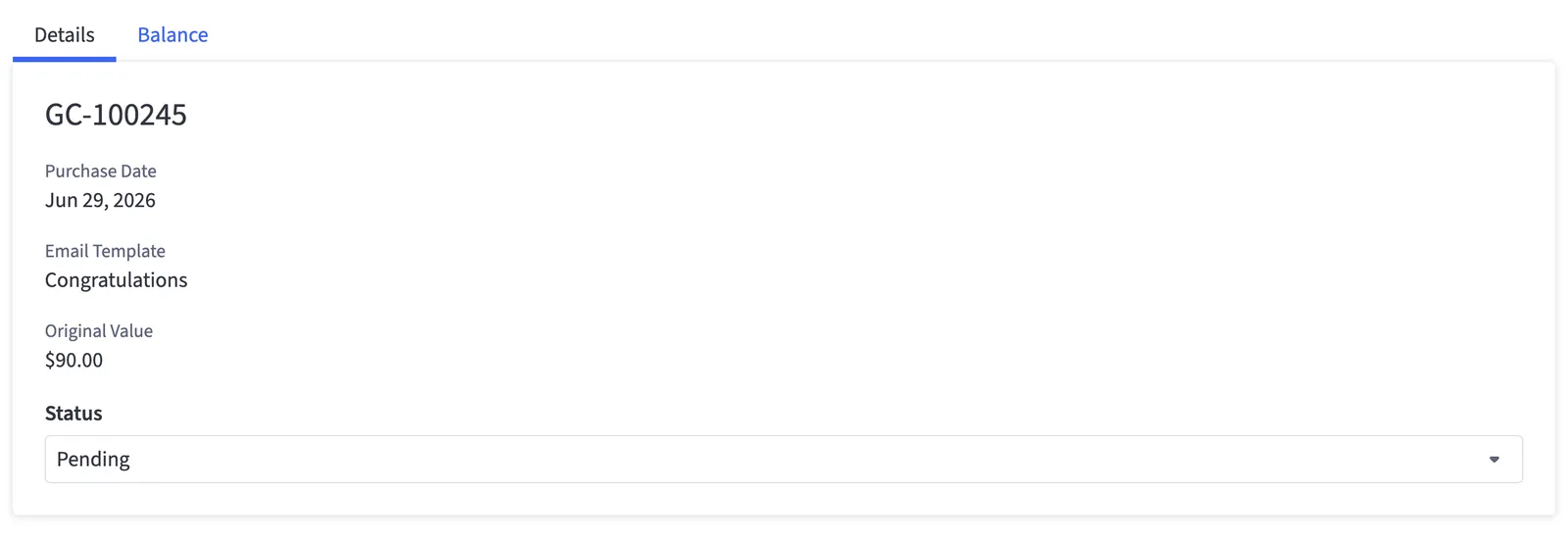
Browse to a gift certificate from the list you built earlier in this exercise, and confirm both tabs render.
[Example code](https://github.com/bigcommerce-edu/starter-sc-app-next/compare/e-ui-06-pre...e-ui-06-post?diff=split)
## Status update and balance refill actions
This step will give you a chance to incorporate BigDesign components and patterns for user actions. The actions we'll implement
for the scope of this tutorial include updating a gift certificate's status and refilling its balance.
### Implement the server actions
The client components that drive user interactivity on the gift certificate detail page directly call server actions - functions
that execute on the server.
**Update** `src/app/store/[storeHash]/gift-certs/[id]/actions.ts`.
**`gift-certs/[id]/actions.ts`**
```js showLineNumbers={false} title="gift-certs/[id]/actions.ts"
"use server";
import { ActionResult } from "@/lib/actions/action-result";
import {
fetchGiftCertificate,
refillGiftCertificateBalance as refillGiftCertificateBalanceRequest,
updateGiftCertificateStatus as updateGiftCertificateStatusRequest,
} from "@/lib/gift-certs-manager/gift-certificates/gift-certificates-api";
import { GiftCertificateStatus } from "@/lib/gift-certs-manager/gift-certificates/types";
import { isNotFoundError, toSafeMessage } from "@/lib/errors/app-error";
import { logError } from "@/lib/errors/logger";
import { revalidatePath } from "next/cache";
const GIFT_CERTIFICATE_NOT_FOUND_MESSAGE =
"That gift certificate no longer exists. It may have been deleted — reload the page to see the current list.";
export async function updateGiftCertificateStatus(
id: number | string,
status: GiftCertificateStatus,
storeHash: string | undefined,
): Promise {
try {
const giftCertificate = await fetchGiftCertificate(id, storeHash);
await updateGiftCertificateStatusRequest(giftCertificate, status, storeHash);
} catch (error) {
logError(`updateGiftCertificateStatus: certificate ${id}`, error);
if (isNotFoundError(error)) {
return { success: false, message: GIFT_CERTIFICATE_NOT_FOUND_MESSAGE };
}
return { success: false, message: toSafeMessage(error, "Failed to update the gift certificate status.") };
}
revalidatePath("/store/[storeHash]/gift-certs/[id]", "page");
revalidatePath("/store/[storeHash]/gift-certs", "page");
return { success: true, message: "Gift certificate status updated." };
}
export async function refillGiftCertificateBalance(
id: number | string,
newBalance: number,
storeHash: string | undefined,
): Promise {
try {
const giftCertificate = await fetchGiftCertificate(id, storeHash);
if (giftCertificate.status !== "active" && giftCertificate.status !== "expired") {
return { success: false, message: "Only active or expired gift certificates can be refilled." };
}
if (!Number.isFinite(newBalance) || newBalance < 0) {
return { success: false, message: "Refill balance must be a non-negative number." };
}
if (newBalance <= giftCertificate.balance) {
return { success: false, message: "Refill balance must be greater than the current gift certificate balance." };
}
if (newBalance > giftCertificate.amount) {
return { success: false, message: "Refill balance cannot exceed the original gift certificate amount." };
}
await refillGiftCertificateBalanceRequest(giftCertificate, newBalance, storeHash);
} catch (error) {
logError(`refillGiftCertificateBalance: certificate ${id}`, error);
if (isNotFoundError(error)) {
return { success: false, message: GIFT_CERTIFICATE_NOT_FOUND_MESSAGE };
}
return { success: false, message: toSafeMessage(error, "Failed to refill the gift certificate balance.") };
}
revalidatePath("/store/[storeHash]/gift-certs/[id]", "page");
revalidatePath("/store/[storeHash]/gift-certs", "page");
return { success: true, message: "Gift certificate balance refilled." };
}
```
Note that the two server action functions accept simple arguments and return simple JSON results; Next.js takes care of wrapping the function
execution in a web request from the client components.
Both actions re-fetch the certificate server-side before acting on it, trusting only the `id` the client supplied. Once again, you're relying on
data access layer functions (like `refillGiftCertificateBalanceRequest`) that already exist; you're not yet concerned with the API call details.
On success, each action calls `revalidatePath` for both the detail and list routes. Without this, the mutation would succeed on the server but the
user would keep seeing the stale values Next.js already rendered, making the action look broken. Invalidating both routes means the certificate's
new status or balance is reflected whether the user stays on the detail page or navigates back to the list.
### Add refill behavior to the balance tab
**Modify** `src/components/gift-certs-manager/gift-certificates/detail/gift-certificate-balance-tab.tsx` to add the refill action, a confirmation modal, and a pending state.
**`gift-certificate-balance-tab.tsx`**
```jsx {3-9,12-16,22-27,36-127} showLineNumbers={false} title="gift-certificate-balance-tab.tsx"
"use client";
import { useState, useTransition } from "react";
import { Box, Button, Flex, Input, Modal, Panel, Small, Text } from "@bigcommerce/big-design";
import {
refillGiftCertificateBalance,
} from "@/app/store/[storeHash]/gift-certs/[id]/actions";
import { runServerAction } from "@/components/ui/action-alerts";
import { canRefill } from "@/lib/gift-certs-manager/gift-certificates/status";
import { GiftCertificate } from "@/lib/gift-certs-manager/gift-certificates/types";
type BalanceAction = "refill";
const ACTION_LABEL: Record = {
refill: "Refill",
};
const currencyFormatter = new Intl.NumberFormat("en-US", { style: "currency", currency: "USD" });
...
function getConfirmationMessage(action: BalanceAction, amount: number): string {
switch (action) {
case "refill":
return `Refill balance to ${currencyFormatter.format(amount)}?`;
}
}
export function GiftCertificateBalanceTab({
giftCertificate,
storeHash,
}: {
giftCertificate: GiftCertificate;
storeHash: string | undefined;
}) {
const [selectedAction, setSelectedAction] = useState(null);
const [pendingAction, setPendingAction] = useState(null);
const [refillAmount, setRefillAmount] = useState(String(giftCertificate.amount));
const [isPending, startTransition] = useTransition();
const toggleAction = (action: BalanceAction) => {
setSelectedAction((current) => (current === action ? null : action));
};
const closeConfirmModal = () => setPendingAction(null);
const dismissConfirmModal = () => {
setPendingAction(null);
setSelectedAction(null);
setRefillAmount(String(giftCertificate.amount));
};
const handleConfirm = () => {
const action = pendingAction;
closeConfirmModal();
startTransition(async () => {
switch (action) {
case "refill":
await runServerAction(() =>
refillGiftCertificateBalance(giftCertificate.id, Number(refillAmount), storeHash),
);
break;
}
});
};
const pendingAmount = refillAmount;
const canSubmitRefill = refillAmount !== "" && Number(refillAmount) > giftCertificate.balance;
return (
{currencyFormatter.format(giftCertificate.amount)}{currencyFormatter.format(giftCertificate.balance)}
{selectedAction === "refill" && (
setRefillAmount(event.target.value)}
type="number"
value={refillAmount}
/>
This will set the total active balance to this amount — more than the current balance of{" "}
{currencyFormatter.format(giftCertificate.balance)}, up to{" "}
{currencyFormatter.format(giftCertificate.amount)}.
)}
{pendingAction && (
{getConfirmationMessage(pendingAction, Number(pendingAmount))}
)}
);
}
```
`canRefill` is a pre-existing helper in the boilerplate's `gift-certificates/status.ts`. It centralizes the conditions under which a refill is
offered at all — currently, that the certificate's status is one that can still be refilled. Using it here rather than an inline status check keeps
the button's enabled state and the server action's own validation from drifting apart. The separate `canSubmitRefill` check then gates the submit
button on the entered amount actually exceeding the current balance, so the action can't be sent in a state the server would just reject.
### Add status update behavior to the details tab
**Modify** `src/components/gift-certs-manager/gift-certificates/detail/gift-certificate-details-tab.tsx` to add cancel and update-status controls.
**`gift-certificate-details-tab.tsx`**
```jsx {3-5,8-9,20-38,52-82} showLineNumbers={false} title="gift-certificate-details-tab.tsx"
"use client";
import { useState, useTransition } from "react";
import { Button, Flex, FlexItem, Modal, Text } from "@bigcommerce/big-design";
import { updateGiftCertificateStatus } from "@/app/store/[storeHash]/gift-certs/[id]/actions";
import { GiftCertificatePartyPanel } from "@/components/gift-certs-manager/gift-certificates/detail/gift-certificate-party-panel";
import { GiftCertificateStatusPanel } from "@/components/gift-certs-manager/gift-certificates/detail/gift-certificate-status-panel";
import { runServerAction } from "@/components/ui/action-alerts";
import { GIFT_CERTIFICATE_STATUS_LABEL } from "@/lib/gift-certs-manager/gift-certificates/status";
import { GiftCertificate, GiftCertificateStatus } from "@/lib/gift-certs-manager/gift-certificates/types";
export function GiftCertificateDetailsTab({
giftCertificate,
storeHash,
}: {
giftCertificate: GiftCertificate;
storeHash: string | undefined;
}) {
const [status, setStatus] = useState(giftCertificate.status);
const [isPending, startTransition] = useTransition();
const [isUpdateModalOpen, setIsUpdateModalOpen] = useState(false);
const isDirty = status !== giftCertificate.status;
const resetStatus = () => setStatus(giftCertificate.status);
const dismissUpdateModal = () => {
setIsUpdateModalOpen(false);
resetStatus();
};
const closeUpdateModal = () => setIsUpdateModalOpen(false);
const handleUpdate = () => {
startTransition(async () => {
await runServerAction(() => updateGiftCertificateStatus(giftCertificate.id, status, storeHash));
closeUpdateModal();
});
};
return (
...
Update status from {GIFT_CERTIFICATE_STATUS_LABEL[giftCertificate.status]} to{" "}
{GIFT_CERTIFICATE_STATUS_LABEL[status]}?
);
}
```
On a gift certificate detail page, you should now be able to observe the UI interactions for status updates and balance refills. **NOTE**, however,
that updates will currently fail. The static mock data you're currently relying on can't be mutated! You'll be revisiting the updating
logic in the next exercise.
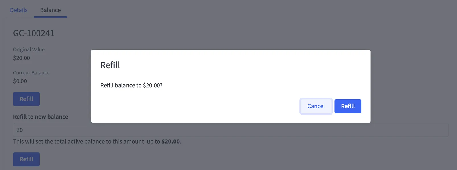
Our basic BigDesign-based UI for managing gift certificates is now complete!
[Example code](https://github.com/bigcommerce-edu/starter-sc-app-next/compare/e-ui-07-pre...e-ui-07-post?diff=split)
## Convert remaining components to BigDesign
The initial project boilerplate still contains a few components built with custom UI not yet converted to BigDesign. These mostly consist of
error pages. After converting these, several custom UI components can finally be deleted.
We won't walk through these final conversions explicitly, but see the example code link below if you want to clean up these final components.
[Example code](https://github.com/bigcommerce-edu/starter-sc-app-next/compare/e-ui-08-pre...e-ui-08-post?diff=split)
## Full step code
[Full diff](https://github.com/bigcommerce-edu/starter-sc-app-next/compare/e-ui-start...e-ui-complete?diff=split)
[Next: Integrate BigCommerce data](/developer/docs/integrations/apps/tutorial-single-click-app/2-bigcommerce-data)